
About
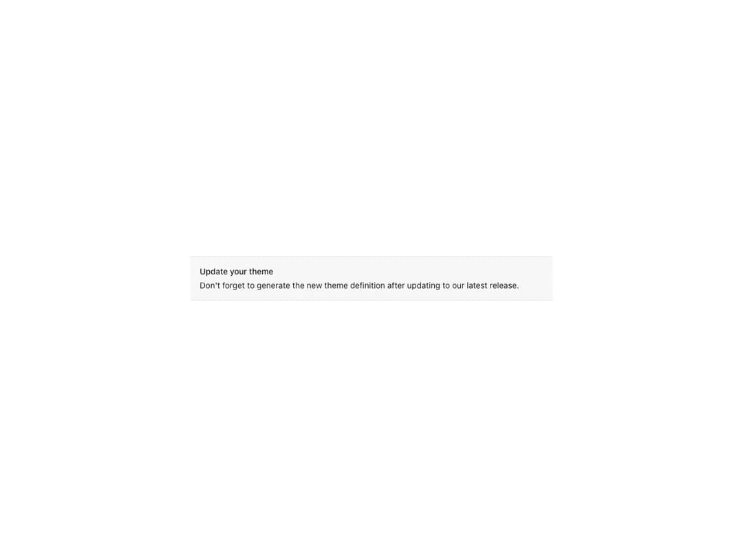
Prominent message related to the entire page or a specific area. Renders a title, an optional icon and a children slot; supports an actions slot, four status colors (critical, warning, positive, primary), inline layout direction and bleed.
Built with React and Tailwind. Copy the prompt and paste it into Claude Code, Cursor or Lovable: your agent adds Reshaped Alert to your project and fits it to your theme.
Code
How Reshaped Alert is used: the demo's code. The component's own source comes with a free account.
Usage.tsx
import { Reshaped } from "reshaped/bundle";
import Alert from "@/components/ui/reshaped-alert";

export default function Demo() {
  return (
    <Reshaped theme="slate">
      <div style={{ maxWidth: 640, width: "100%", margin: "0 auto", padding: 24 }}>
        <Alert bleed={4} title="Update your theme">
          Don't forget to generate the new theme definition after updating to our
          latest release.
        </Alert>
      </div>
    </Reshaped>
  );
}
Dependencies
More by reshaped
View all
Reshaped Toast
9
Reshaped Calendar
9
Reshaped Progress indicator
7
Reshaped Context menu
7
Reshaped Checkbox
7
Reshaped Autocomplete
7
Reshaped Pagination
6
Reshaped Carousel
6