
About
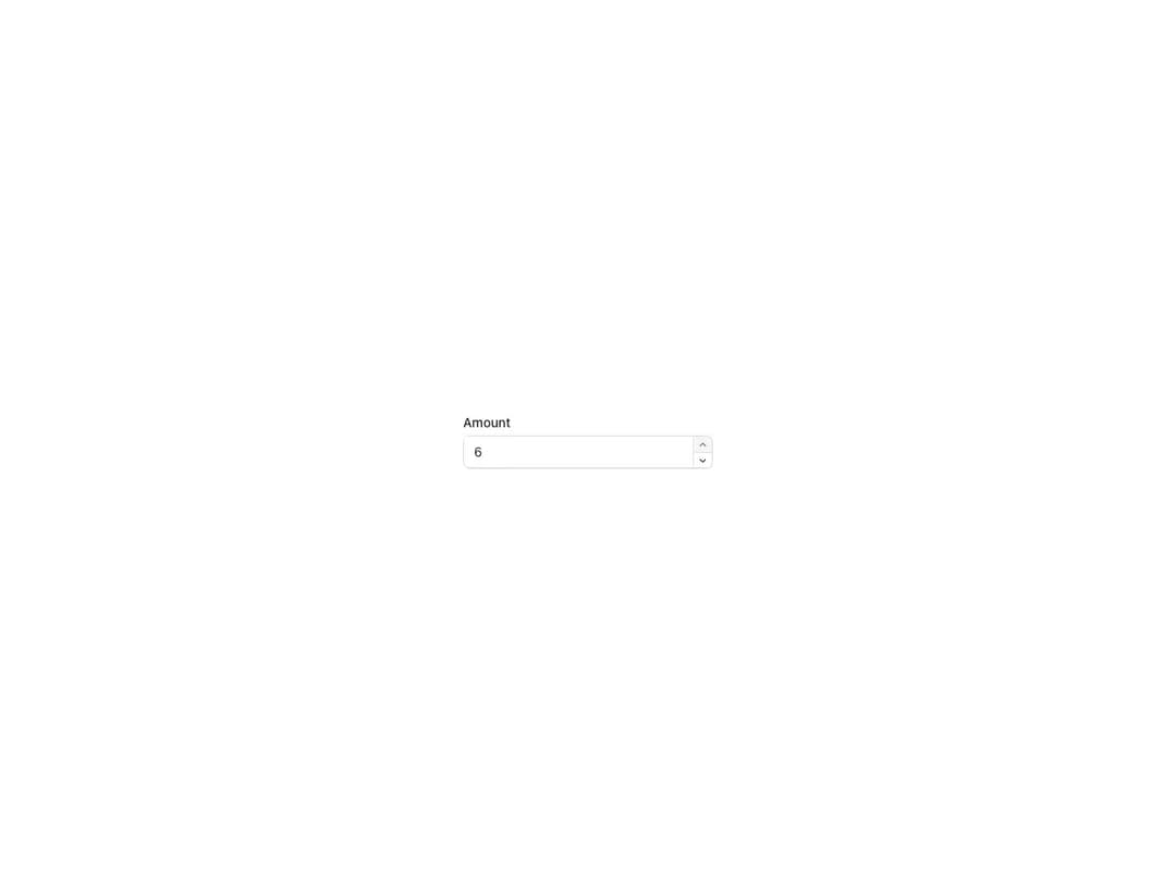
Numeric input with increase/decrease controls and keyboard arrow support, based on TextField so it inherits its variants and sizes. Works in controlled and uncontrolled modes, supports icons, and integrates with the FormControl utility for labels and status messages.
Built with React and Tailwind. Copy the prompt and paste it into Claude Code, Cursor or Lovable: your agent adds Reshaped Number field to your project and fits it to your theme.
Code
How Reshaped Number field is used: the demo's code. The component's own source comes with a free account.
Usage.tsx
import { FormControl, Reshaped } from "reshaped/bundle";
import NumberField from "@/components/ui/reshaped-number-field";

export default function Demo() {
  return (
    <Reshaped theme="slate">
      <div style={{ maxWidth: 320, width: "100%", margin: "0 auto", padding: 24 }}>
        <FormControl>
          <FormControl.Label>Amount</FormControl.Label>
          <NumberField
            name="name"
            defaultValue={5}
            increaseAriaLabel="Increase value"
            decreaseAriaLabel="Decrease value"
          />
        </FormControl>
      </div>
    </Reshaped>
  );
}
Dependencies
More by reshaped
View all
Reshaped Toast
9
Reshaped Calendar
9
Reshaped Progress indicator
7
Reshaped Context menu
7
Reshaped Checkbox
7
Reshaped Autocomplete
7
Reshaped Pagination
6
Reshaped Carousel
6
More in Forms
View all

Premium Auth
500

Login 2
7
Authentication Card
47

Login 1
52

Contact Card
1K
Login Form
6

Form
16

Book A Demo 3
83
