
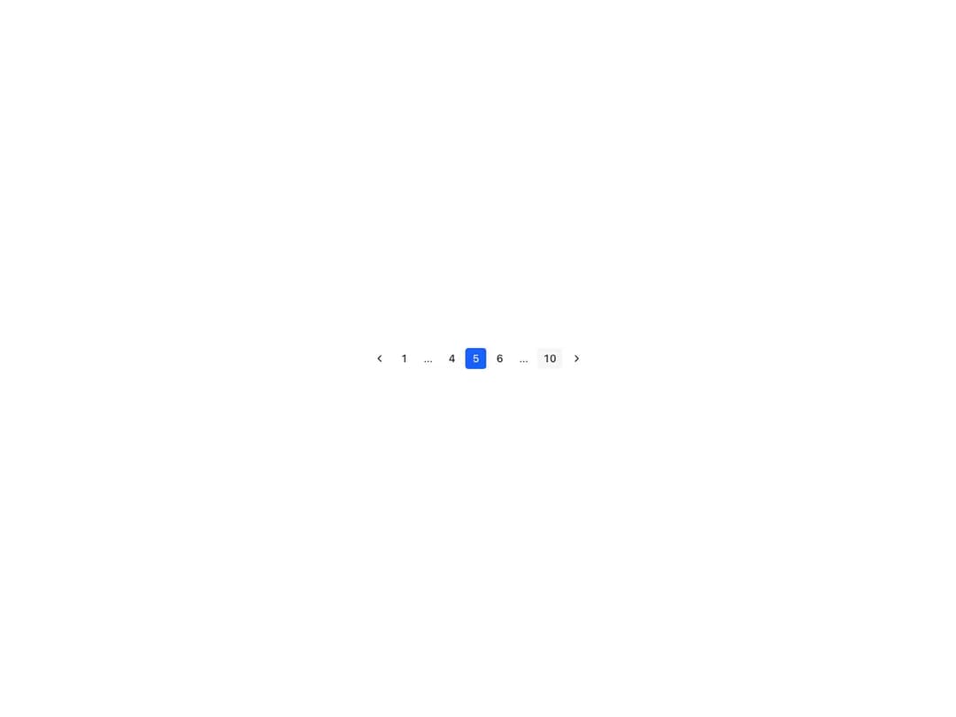
About
Renders the full range of pages from the total count, automatically truncating the display around the currently selected page. Requires aria-labels for the previous/next controls, supports per-page aria-labels, an onChange handler and both controlled and uncontrolled page state.
Built with React and Tailwind. Copy the prompt and paste it into Claude Code, Cursor or Lovable: your agent adds Reshaped Pagination to your project and fits it to your theme.
Code
How Reshaped Pagination is used: the demo's code. The component's own source comes with a free account.
Usage.tsx
import { Reshaped } from "reshaped/bundle";
import Pagination from "@/components/ui/reshaped-pagination";

export default function Demo() {
  return (
    <Reshaped theme="slate">
      <div style={{ margin: "0 auto", padding: 24, display: "flex", justifyContent: "center" }}>
        <Pagination
          total={10}
          page={5}
          previousAriaLabel="Previous page"
          nextAriaLabel="Next page"
        />
      </div>
    </Reshaped>
  );
}
Dependencies
More by reshaped
View all
Reshaped Toast
9
Reshaped Calendar
9
Reshaped Progress indicator
7
Reshaped Context menu
7
Reshaped Checkbox
7
Reshaped Autocomplete
7
Reshaped Carousel
6
Reshaped Slider
5
More in Navigation
View all

Sidebar
234

Tabs
60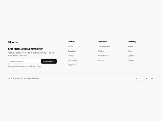
Newsletter Signup Footer
16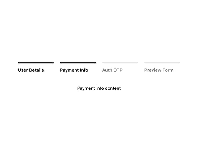
Progress Bar Stepper
36

Footer 2
201
Navbar with Theme Toggle
43

Navbar
71

Pagination
86
