
About
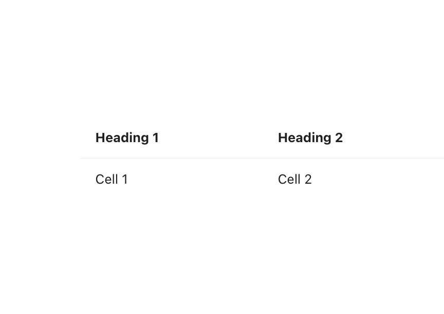
Collection of compound components (Table.Row, Table.Cell, Table.Heading, Table.Head, Table.Body) for building tables from simple cells to headed layouts. Supports outer and column borders, row highlighting, colSpan/rowSpan, cell padding/width/alignment, card composition and interactive datasets like checkbox row selection.
Built with React and Tailwind. Copy the prompt and paste it into Claude Code, Cursor or Lovable: your agent adds Reshaped Table to your project and fits it to your theme.
Code
How Reshaped Table is used: the demo's code. The component's own source comes with a free account.
Usage.tsx
import { Reshaped } from "reshaped/bundle";
import Table from "@/components/ui/reshaped-table";

export default function Demo() {
  return (
    <Reshaped theme="slate">
      <div style={{ maxWidth: 480, width: "100%", margin: "0 auto", padding: 24 }}>
        <Table>
          <Table.Row>
            <Table.Heading>Heading 1</Table.Heading>
            <Table.Heading>Heading 2</Table.Heading>
          </Table.Row>
          <Table.Row>
            <Table.Cell>Cell 1</Table.Cell>
            <Table.Cell>Cell 2</Table.Cell>
          </Table.Row>
        </Table>
      </div>
    </Reshaped>
  );
}
Dependencies
More by reshaped
View all
Reshaped Toast
9
Reshaped Calendar
9
Reshaped Progress indicator
7
Reshaped Context menu
7
Reshaped Checkbox
7
Reshaped Autocomplete
7
Reshaped Pagination
6
Reshaped Carousel
6