
About
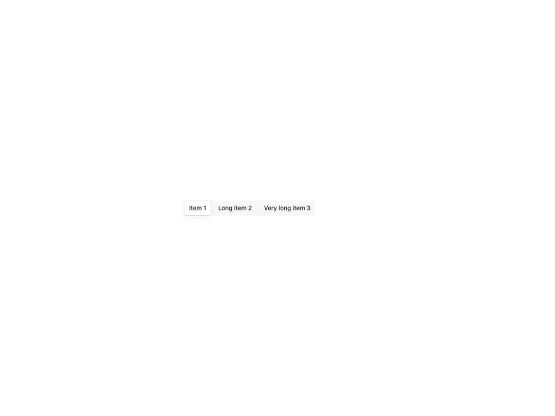
Compound Tabs.List / Tabs.Item / Tabs.Panel component with matching ids, per-item icons and full composition control. Supports pills, pills-raised and borderless variants, row or column direction, three sizes, controlled and uncontrolled selection, equal-width items, flexible panel placement and native radio form submission via the name prop.
Built with React and Tailwind. Copy the prompt and paste it into Claude Code, Cursor or Lovable: your agent adds Reshaped Tabs to your project and fits it to your theme.
Code
How Reshaped Tabs is used: the demo's code. The component's own source comes with a free account.
Usage.tsx
import { Reshaped } from "reshaped/bundle";
import Tabs from "@/components/ui/reshaped-tabs";

export default function Demo() {
  return (
    <Reshaped theme="slate">
      <div style={{ maxWidth: 480, width: "100%", margin: "0 auto", padding: 24 }}>
        <Tabs variant="pills-raised" name="tabs" defaultValue="1">
          <Tabs.List>
            <Tabs.Item value="1">Item 1</Tabs.Item>
            <Tabs.Item value="2">Long item 2</Tabs.Item>
            <Tabs.Item value="3">Very long item 3</Tabs.Item>
          </Tabs.List>
        </Tabs>
      </div>
    </Reshaped>
  );
}
Dependencies
More by reshaped
View all
Reshaped Toast
9
Reshaped Calendar
9
Reshaped Progress indicator
7
Reshaped Context menu
7
Reshaped Checkbox
7
Reshaped Autocomplete
7
Reshaped Pagination
6
Reshaped Carousel
6