
About
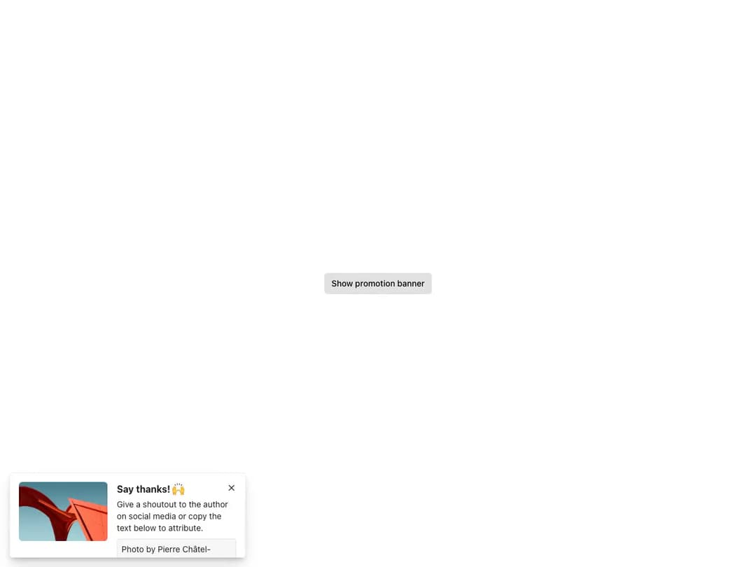
Notification system driven by the useToast hook (show/hide) and ToastProvider for scoped render regions. Toasts support an icon, title, text and 1-2 actions, five colors (inverted default plus neutral/primary/positive/critical), configurable position, timeout and width, vertical action layout, a custom startSlot and fully custom children layouts for banners.
Built with React and Tailwind. Copy the prompt and paste it into Claude Code, Cursor or Lovable: your agent adds Reshaped Toast to your project and fits it to your theme.
Code
How Reshaped Toast is used: the demo's code. The component's own source comes with a free account.
Usage.tsx
import { Button, Dismissible, Image, Reshaped, Text, View } from "reshaped/bundle";
import { useToast } from "@/components/ui/reshaped-toast";

function Trigger() {
  const toast = useToast();
  return (
    <Button
      onClick={() => {
        const id = toast.show({
          children: (
            <View gap={4} direction="row">
              <View aspectRatio={1 / 1}>
                <Image
                  height="100px"
                  src="https://cdn.21st.dev/assets/mirror/dc/dcb6814358fd29dad23421dfd8b1bf8c445e0640d73a68e54946b8f5d64e364e.webp"
                  borderRadius="medium"
                />
              </View>
              <View.Item grow>
                <View gap={1}>
                  <Dismissible
                    closeAriaLabel="Close notification"
                    onClose={() => toast.hide(id)}
                  >
                    <Text variant="body-1" weight="bold">
                      Say thanks! 🙌
                    </Text>
                  </Dismissible>
                  <Text variant="body-2">
                    Give a shoutout to the author on social media or copy the text
                    below to attribute.
                  </Text>
                  <View.Item gapBefore={2}>
                    <View
                      padding={2}
                      borderColor="neutral-faded"
                      backgroundColor="neutral-faded"
                      borderRadius="small"
                    >
                      Photo by Pierre Châtel-Innocenti
                    </View>
                  </View.Item>
                </View>
              </View.Item>
            </View>
          ),
          color: "neutral",
          position: "bottom-start",
          timeout: 0,
          width: "long",
        });
      }}
    >
      Show promotion banner
    </Button>
  );
}

export default function Demo() {
  return (
    <Reshaped theme="slate">
      <div style={{ minHeight: 420, display: "flex", alignItems: "center", justifyContent: "center", padding: 24 }}>
        <Trigger />
      </div>
    </Reshaped>
  );
}
Dependencies
More by reshaped
View all
Reshaped Calendar
9
Reshaped Progress indicator
7
Reshaped Context menu
7
Reshaped Checkbox
7
Reshaped Autocomplete
7
Reshaped Pagination
6
Reshaped Carousel
6
Reshaped Slider
5