
About
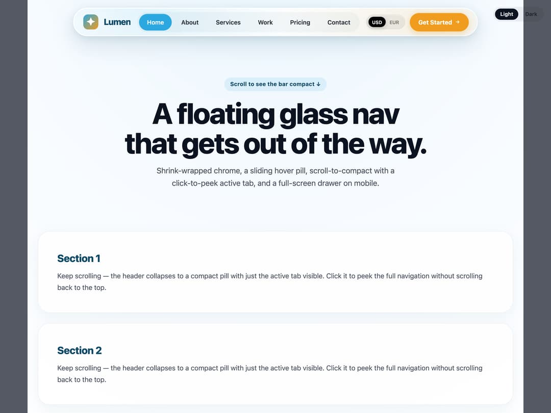
Floating glass-pill navbar that compacts on scroll to just the active tab, with a sliding hover pill, click-to-peek, mobile drawer, and light/dark tones.
Built with React and Tailwind. Copy the prompt and paste it into Claude Code, Cursor or Lovable: your agent adds Glass Nav to your project and fits it to your theme.
Code
How Glass Nav is used: the demo's code. The component's own source comes with a free account.
Usage.tsx
"use client";

import { useState } from "react";
import { GlassNav, type GlassNavTone } from "@/components/ui/glass-nav";

/**
 * Demo: the glass-pill nav floating over a scrollable page.
 * Scroll down to watch it compact — the logo morphs to the spark mark and the
 * nav collapses to just the active tab. Click the active tab to peek it open.
 * Use the Light / Dark switch (top-right) to preview both surface tones.
 */
function Demo() {
  const [tone, setTone] = useState<GlassNavTone>("light");
  const dark = tone === "dark";

  return (
    <div
      className="min-h-screen transition-colors duration-500"
      style={{
        color: dark ? "#EAF1F6" : "#0B1220",
        background: dark
          ? "radial-gradient(120% 80% at 50% -10%, #0f3040 0%, #0a1622 55%, #060a12 100%)"
          : "radial-gradient(120% 80% at 50% -10%, #eaf6fd 0%, #f7fbff 45%, #ffffff 100%)",
      }}
    >
      <GlassNav brandName="Lumen" cta={{ label: "Get Started", href: "#start" }} tone={tone} />

      {/* Tone switch (demo control, not part of the component) */}
      <div className="pointer-events-none fixed right-4 top-4 z-[80] flex justify-end">
        <div
          className={`pointer-events-auto inline-flex items-center gap-1 rounded-full p-1 text-[12px] font-semibold ${
            dark ? "bg-white/10 text-white/70" : "bg-black/[0.06] text-black/60"
          }`}
        >
          {(["light", "dark"] as const).map((tn) => (
            <button
              key={tn}
              type="button"
              onClick={() => setTone(tn)}
              className={`rounded-full px-3 py-1 capitalize transition-colors ${
                tone === tn
                  ? dark
                    ? "bg-white text-[#0B1220]"
                    : "bg-[#0B1220] text-white"
                  : ""
              }`}
            >
              {tn}
            </button>
          ))}
        </div>
      </div>

      <main className="mx-auto max-w-6xl px-6">
        <section className="py-24 text-center">
          <p
            className={`mb-4 inline-block rounded-full px-3.5 py-1.5 text-[13px] font-bold tracking-[0.02em] ${
              dark ? "bg-white/10 text-[#9FD8F2]" : "bg-[rgba(43,168,224,0.12)] text-[#0F4A66]"
            }`}
          >
            Scroll to see the bar compact ↓
          </p>
          <h1 className="mx-0 mb-4 text-[clamp(38px,6vw,68px)] font-extrabold leading-[1.02] tracking-[-0.035em]">
            A floating glass nav
            <br />
            that gets out of the way.
          </h1>
          <p
            className={`mx-auto max-w-[560px] text-[18px] leading-relaxed ${
              dark ? "text-[rgba(234,241,246,0.7)]" : "text-[#4A5261]"
            }`}
          >
            Shrink-wrapped chrome, a sliding hover pill, scroll-to-compact with a
            click-to-peek active tab, and a full-screen drawer on mobile.
          </p>
        </section>

        {Array.from({ length: 6 }).map((_, i) => (
          <section
            key={i}
            className={`mb-6 rounded-[28px] border p-11 ${
              dark
                ? "border-white/10 bg-white/[0.04]"
                : "border-[rgba(15,74,102,0.08)] bg-white/70 shadow-[0_10px_30px_rgba(15,74,102,0.06)]"
            }`}
          >
            <h2
              className={`mb-2.5 text-[24px] font-extrabold tracking-[-0.02em] ${
                dark ? "text-[#7FD0F2]" : "text-[#0F4A66]"
              }`}
            >
              Section {i + 1}
            </h2>
            <p
              className={`text-[16px] leading-[1.7] ${
                dark ? "text-[rgba(234,241,246,0.68)]" : "text-[#4A5261]"
              }`}
            >
              Keep scrolling — the header collapses to a compact pill with just the
              active tab visible. Click it to peek the full navigation without
              scrolling back to the top.
            </p>
          </section>
        ))}
        <div className="h-10" />
      </main>
    </div>
  );
}

export { Demo };
export default Demo;
More in Navigation
View all

Sidebar
235
Navbar with Theme Toggle
43

Sidebar
339

Tabs
60
Numberless Pagination with Text
11
Oversized 404 Numeral
50
Footer
446
Pagination
43


