
About
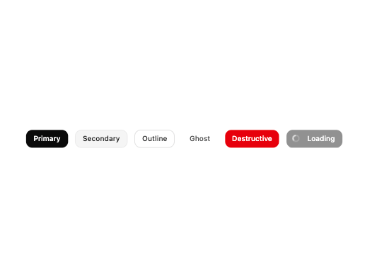
A versatile button component supporting multiple variants, sizes, icons, and a loading state.
Built with React and Tailwind. Copy the prompt and paste it into Claude Code, Cursor or Lovable: your agent adds Great UI Button to your project and fits it to your theme.
Code
How Great UI Button is used: the demo's code. The component's own source comes with a free account.
Usage.tsx
import Button from "@/components/ui/great-ui-button"

export default function ButtonPreview() {
  return (
    <div className="flex flex-wrap items-center justify-center gap-4 p-6">
      <Button variant="primary">Primary</Button>
      <Button variant="secondary">Secondary</Button>
      <Button variant="outline">Outline</Button>
      <Button variant="ghost">Ghost</Button>
      <Button variant="destructive">Destructive</Button>
      <Button variant="primary" isLoading>
        Loading
      </Button>
    </div>
  )
}
More by Saurabh Sharma
View all
Great UI Diagonal Marquee Carousel
756
Great UI Macbook Mockup
212
Great UI Mobile Mockup
176
Great UI Vinyl Album Card
127
Great UI Animated Select
84
Great UI Deployment Checklist
73
Great UI Revision Timeline
71
Great UI Terminal Loader
57
More in Buttons
View all
Button Save
46

Button
20

Eclipse Button
5

Button
6

Button
14

Button Group
37

Button
32
Split Button
32

