
About
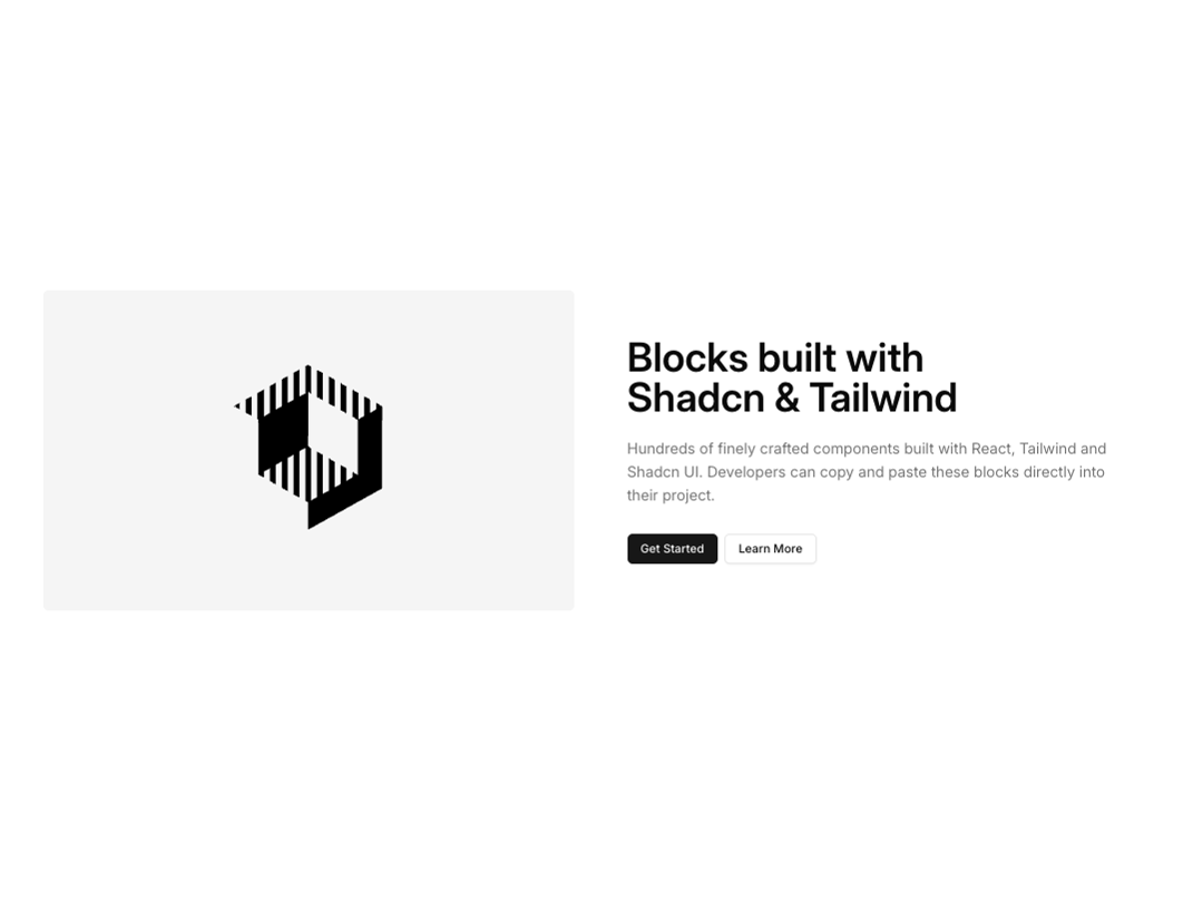
Basic feature section with heading, description and buttons. Image on left
Built with React and Tailwind. Copy the prompt and paste it into Claude Code, Cursor or Lovable: your agent adds Feature 2 to your project and fits it to your theme.
Code
How Feature 2 is used: the demo's code. The component's own source comes with a free account.
Usage.tsx
import { Feature2 } from "@/components/ui/feature-2";

const DemoOne = () => {
  return (
    <Feature2
      title="Blocks built with Shadcn & Tailwind"
      description="Hundreds of finely crafted components built with React, Tailwind and Shadcn UI. Developers can copy and paste these blocks directly into their project."
      imageSrc="https://cdn.21st.dev/assets/mirror/9f/9fb9487617e0903ab5bb8012f11530f61a39e4f1f19f169a87a367887fdaeecb.svg"
      imageAlt="placeholder hero"
      buttonPrimary={{
        label: "Get Started",
        href: "https://shadcnblocks.com"
      }}
      buttonSecondary={{
        label: "Learn More",
        href: "https://shadcnblocks.com"
      }}
  />
  );
};

export { DemoOne };
More by Shadcnblocks.com
View all

Gallery with image cards
3K
Hero 195
2.3K
Feature 108
1.3K
Navbar with Dropdowns
870
Gallery 6
557
Footer 7
555
Feature 197
524
About 3
428
More in Heroes
View all

SaaS Template
2.4K

Responsive Hero Banner
2K

Hero
1.2K
Centered Hero with Image Fan
932
Editorial Collage Hero
431
Glass Fold
212

HeroSectionWithGradient
336

Aero Hero-3
559
