

About
Tabs with animations
Built with React and Tailwind. Copy the prompt and paste it into Claude Code, Cursor or Lovable: your agent adds Sliding Tabs to your project and fits it to your theme.
Code
How Sliding Tabs is used: the demo's code. The component's own source comes with a free account.
Usage.tsx
"use client";

import SlidingTabs from "@/components/ui/motion-sliding-tabs";
import { useState } from "react";

type Section = "overview" | "analytics" | "settings";

export default function SlidingTabsDemo() {
  const [value, setValue] = useState<Section>("overview");

  return (
    <div className="flex w-full h-full items-center justify-center p-10">
      <SlidingTabs
        label="Sections"
        value={value}
        onValueChange={setValue}
        items={[
          { value: "overview", label: "Overview" },
          { value: "analytics", label: "Analytics" },
          { value: "settings", label: "Settings" },
        ]}
      />
    </div>
  );
}
More by ShadcnStore
View all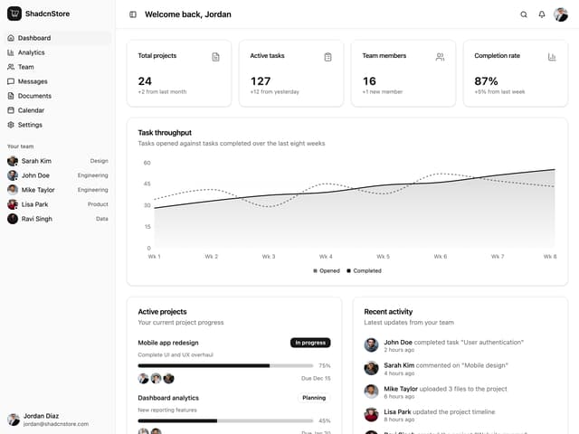

App Dashboard Layout
276
Users List Datatable
104
Pricing Section 1
92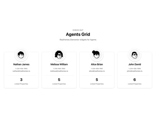
Agents Team Grid
33
CTA Section
33
Team Profile Grid
26
Login Page 1
26
Changelog List
21