
About
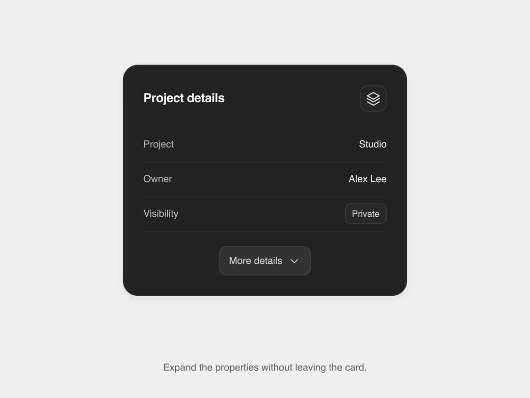
A collapsible details card that lists key project properties and reveals extra fields in place via a 'More details' toggle, without navigating away — ported to React from SLtowl's SL UI Library 'details-display' package (MIT).
Built with React and Tailwind. Copy the prompt and paste it into Claude Code, Cursor or Lovable: your agent adds Details Display to your project and fits it to your theme.
Code
How Details Display is used: the demo's code. The component's own source comes with a free account.
Usage.tsx
import DetailsDisplay from "@/components/ui/matte-details-display";

export default function DetailsDisplayDemo() {
  return (
    <div className="min-h-screen w-full flex items-center justify-center bg-[#efefef] p-5">
      <div
        className="w-full max-w-[320px]"
        style={{ containerType: "inline-size" }}
      >
        <DetailsDisplay />
      </div>
    </div>
  );
}
More by sltowl
View all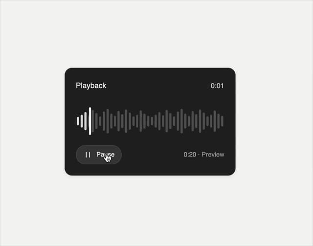
Playback Scrubber
43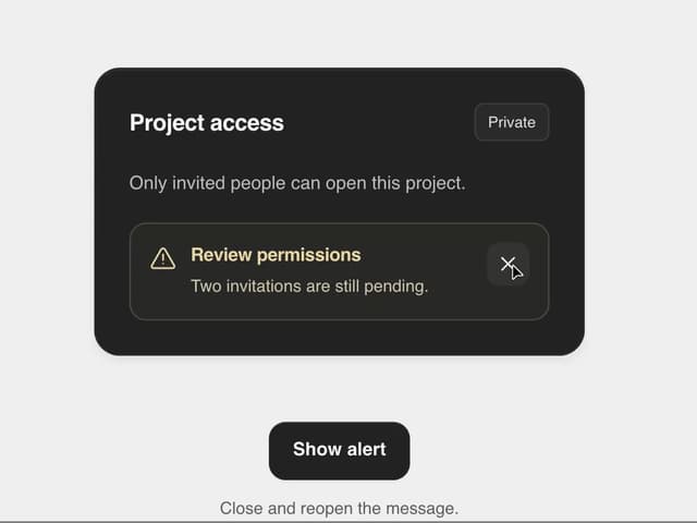
Matte Alert Feedback
41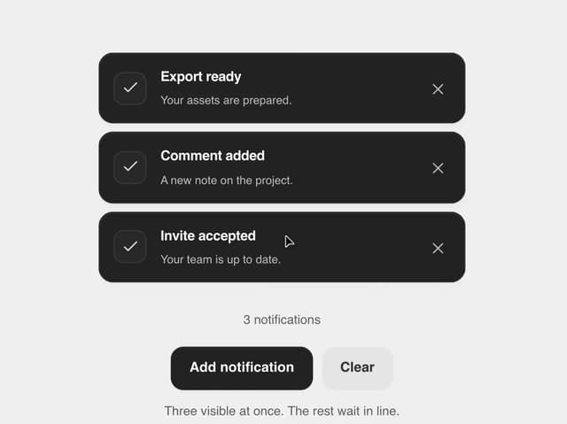
Notification Stack
30
Time Window Slider
20
Commands Menu
14
Matte Meter Slider
14
Matte Opacity Slider
12
Undo Feedback
8