
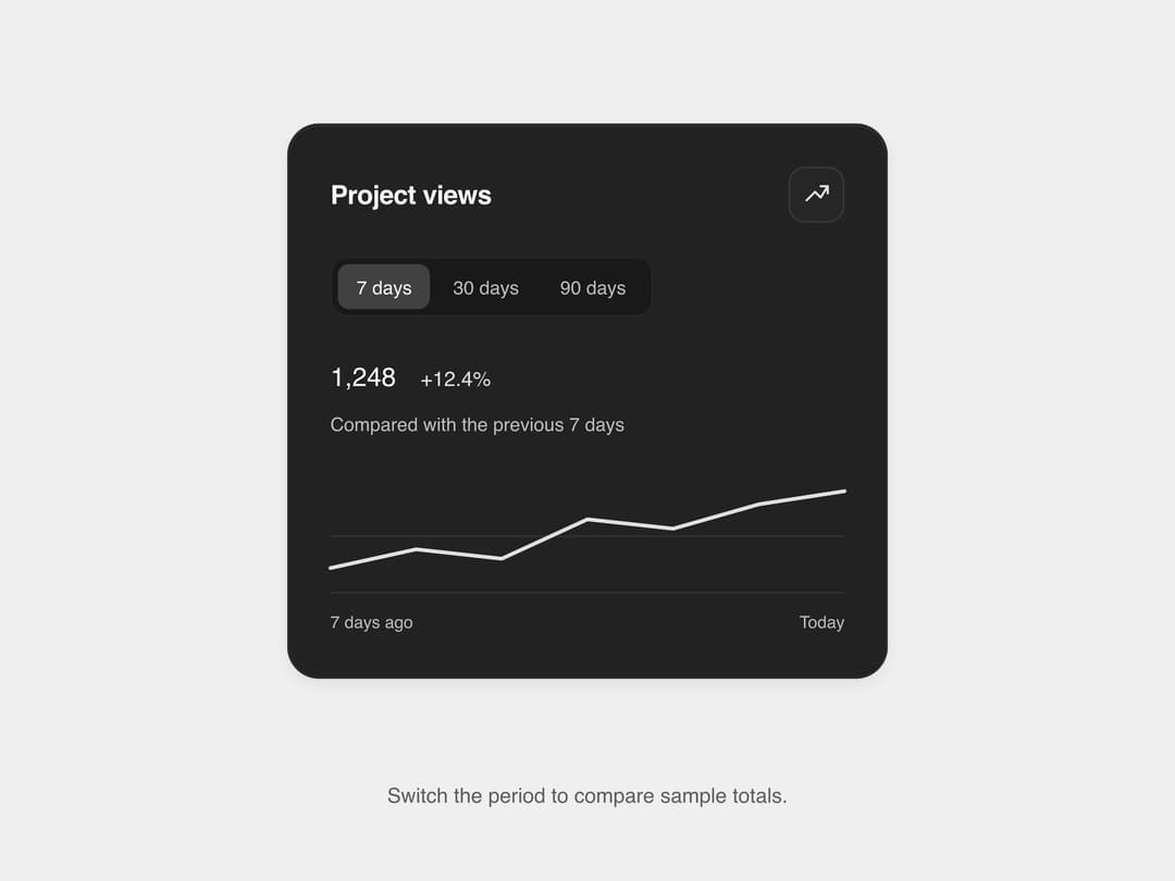
About
A dark matte metric card that shows a headline number with an animated sparkline and trend, with segmented buttons to switch the comparison period (7/30/90 days). Ported to React from SL UI Library's vanilla HTML/CSS/JS "data display" component (MIT, credit SLtowl).
Built with React and Tailwind. Copy the prompt and paste it into Claude Code, Cursor or Lovable: your agent adds Matte Metric Display to your project and fits it to your theme.
Code
How Matte Metric Display is used: the demo's code. The component's own source comes with a free account.
Usage.tsx
import MetricDisplay from "@/components/ui/matte-metric-display";

export default function MatteMetricDisplayDemo() {
  return (
    <div
      className="flex min-h-screen w-full items-center justify-center p-5"
      style={{ background: "#efefef" }}
    >
      <MetricDisplay />
    </div>
  );
}
More by sltowl
View all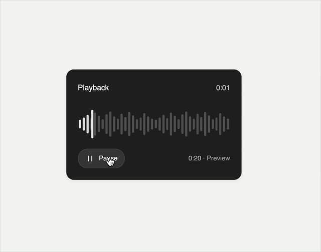
Playback Scrubber
43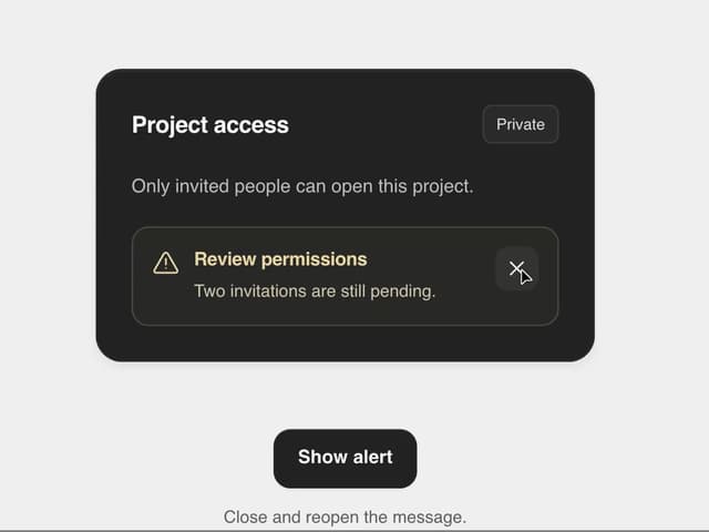
Matte Alert Feedback
41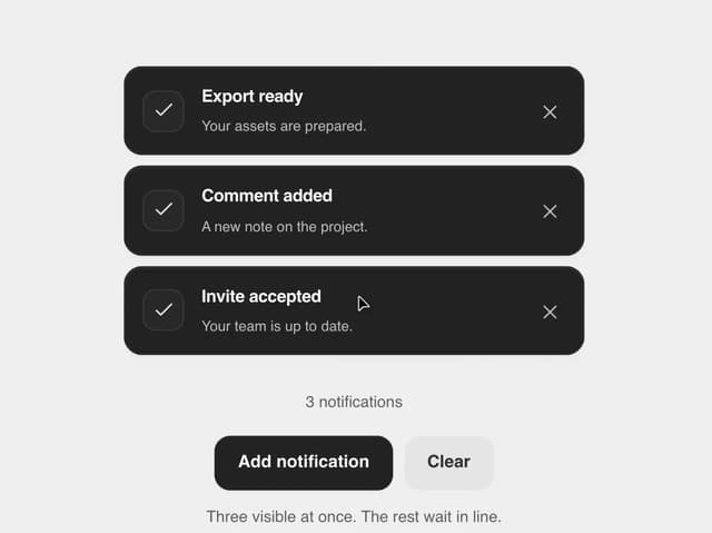
Notification Stack
30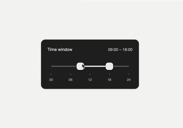
Time Window Slider
20
Commands Menu
14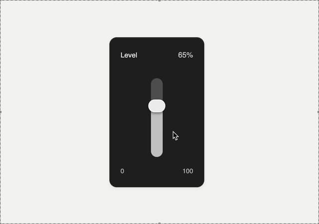
Matte Meter Slider
14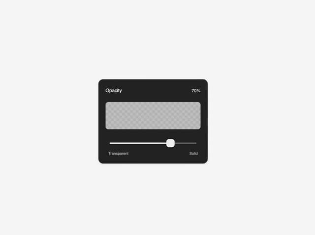
Matte Opacity Slider
12
Undo Feedback
8
More in Dashboards
View all
Dashboard with Collapsible Sidebar
2.4K

Sidebar
235

SaaS Template
2.4K
Stats Bento
1.1K

Financial Bento Grid
71
Stats cards with links
33

Course Design Cards
1.1K

Chat template
598


