
About
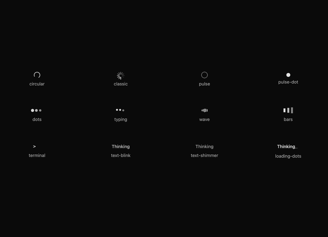
A loading component with multiple variants to indicate processing states and provide visual feedback to users during wait times.
Built with React and Tailwind. Copy the prompt and paste it into Claude Code, Cursor or Lovable: your agent adds Animated Loader Collection to your project and fits it to your theme.
Code
How Animated Loader Collection is used: the demo's code. The component's own source comes with a free account.
Usage.tsx
"use client"

import { Loader } from "@/components/ui/loader"

export default function LoaderBasic() {
  const variants = [
    "circular",
    "classic",
    "pulse",
    "pulse-dot",
    "dots",
    "typing",
    "wave",
    "bars",
    "terminal",
    "text-blink",
    "text-shimmer",
    "loading-dots",
  ] as const

  return (
    <div className="flex w-full flex-col space-y-8 p-4">
      <div className="grid grid-cols-2 gap-8 sm:grid-cols-3 md:grid-cols-4">
        {variants.map((variant) => (
          <div
            key={variant}
            className="flex flex-col items-center justify-center gap-2 p-4"
          >
            <Loader variant={variant} />
            <span className="text-muted-foreground text-sm">{variant}</span>
          </div>
        ))}
      </div>
    </div>
  )
}
More by SO called
View all

Developer Sign-In Flow
3.2K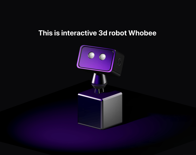
Interactive 3D Robot
2.1K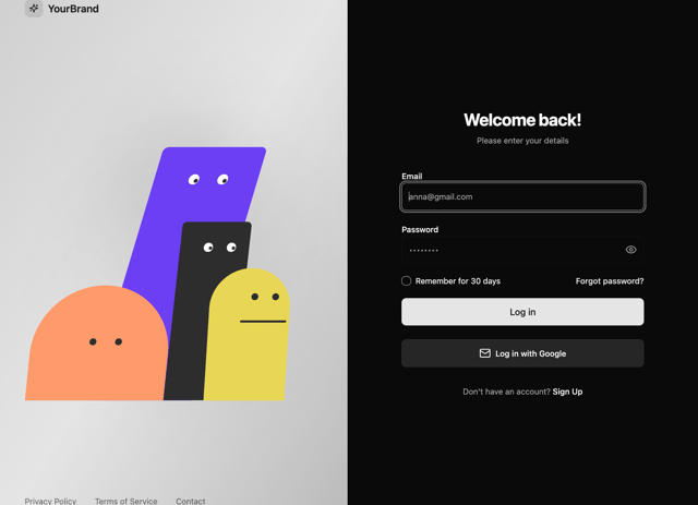
Animated Characters Login Page
1.6K
Interactive Galaxy Hero
1.4K
Product Mockup Section
1.4K
3D Boxes Hero
995
Expandable Content Card
990
AI Prompt Input
617
More in Text
View all
Motion Blur Text
36

Vertical Cut Reveal Characters
103

NeonRGBTextEffect
144
Text Reveal
27
Random Letter Swap
46

Rainbow Text Effect
47
Text Color
545

Blur Reveal
300