About
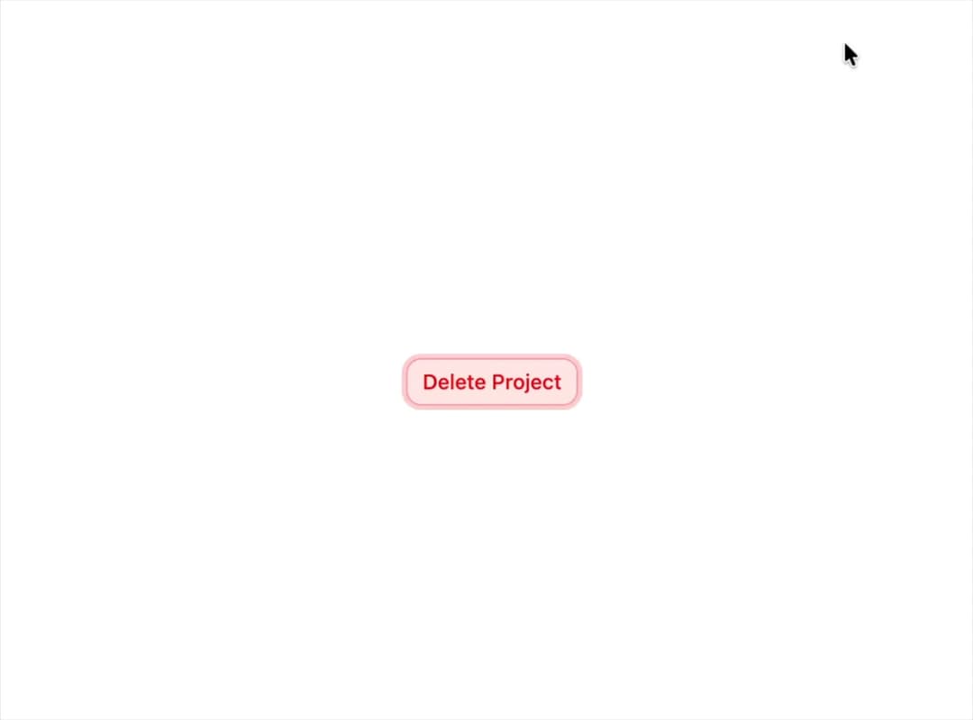
A confirmation alert dialog for destructive or irreversible actions, built on Base UI with a 3D perspective blur entrance/exit animation, optional media icon slot, and a compact size variant.
Built with React and Tailwind. Copy the prompt and paste it into Claude Code, Cursor or Lovable: your agent adds Base Alert Dialog to your project and fits it to your theme.
Code
How Base Alert Dialog is used: the demo's code. The component's own source comes with a free account.
Usage.tsx
"use client";

import {
  AlertDialog,
  AlertDialogAction,
  AlertDialogCancel,
  AlertDialogContent,
  AlertDialogDescription,
  AlertDialogFooter,
  AlertDialogHeader,
  AlertDialogMedia,
  AlertDialogTitle,
  AlertDialogTrigger,
} from "@/components/ui/base-alert-dialog";
import { AlertTriangleIcon } from "lucide-react";
import { useState } from "react";
import { Button } from "@/components/ui/base-alert-dialog-utils/button";

export default function AlertDialogDemo() {
  const [open, setOpen] = useState(false);

  return (
    <div className="flex items-center justify-center p-4">
      <AlertDialog onOpenChange={setOpen} open={open}>
        <AlertDialogTrigger
          render={<Button variant="destructive">Delete Project</Button>}
        />
        <AlertDialogContent>
          <AlertDialogHeader>
            <AlertDialogMedia className="bg-destructive/10 text-destructive">
              <AlertTriangleIcon />
            </AlertDialogMedia>
            <AlertDialogTitle>Are you absolutely sure?</AlertDialogTitle>
            <AlertDialogDescription>
              This action cannot be undone. This will permanently delete your
              project repository, database records, and remove all associated
              API keys.
            </AlertDialogDescription>
          </AlertDialogHeader>
          <AlertDialogFooter>
            <AlertDialogCancel>Cancel</AlertDialogCancel>
            <AlertDialogAction
              closeOnClick
              onClick={() => setOpen(false)}
              variant="destructive"
            >
              Delete repository
            </AlertDialogAction>
          </AlertDialogFooter>
        </AlertDialogContent>
      </AlertDialog>
    </div>
  );
}
Dependencies
More by soralabs
View all

Scroll Gallery
202
Dia Text Reveal
143
Dock Nav
133
Text Reveal Block
105
Pixelated Image Reveal
94
Text Roll
60
Custom Cursor
47
Section CTA
28