

About
A Tailwind palette picker with search, hex and opacity inputs, and optional linear, radial, and conic gradients with draggable stops.
Built with React and Tailwind. Copy the prompt and paste it into Claude Code, Cursor or Lovable: your agent adds Color Picker to your project and fits it to your theme.
Code
How Color Picker is used: the demo's code. The component's own source comes with a free account.
Usage.tsx
import { useState } from 'react'
import ColorPicker, { ColorPickerPopover } from '@/components/ui/color-picker'

const brandColors = ['#ff5a1f', '#1d1d1f', '#f5f0e8', '#3b5bdb', '#12b886']

export default function Demo() {
  const [fill, setFill] = useState('#2b7fff')

  return (
    <div className="flex flex-col items-center gap-4">
      <div
        aria-hidden="true"
        className="size-40 rounded-[16px] shadow-card"
        style={{ background: fill || 'transparent' }}
      />
      <ColorPickerPopover
        allowGradient
        label="Fill"
        onValueChange={setFill}
        recentColors={brandColors}
        recentLabel="Brand colors"
        align="center"
        side="right"
        value={fill}
      />
    </div>
  )
}
Dependencies
More by Syed Hasnain
View all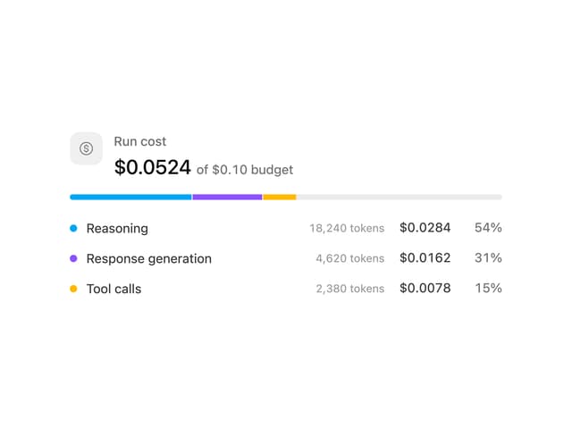
Cost Meter
30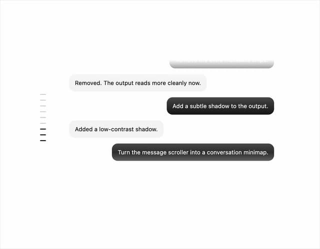
Message Scroller
24
Quota Banner
21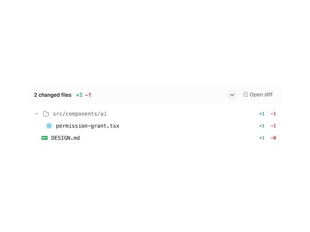
Commit
17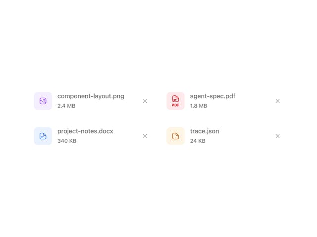
Attachments
16
Image Generation Loader
15
Background Inbox
15
Video Player
14
More in AI chats
View all

AI Actions
319
Agent Chat
17
Prompt with Model Picker
2
Message Thread
36

System Message
54
Suggestions
28

Modal Card
101

Message With Header And Delivery Status
38


