
About
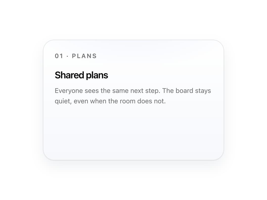
A card whose gradient spotlight follows the cursor, then lifts into a soft shadow.
Built with React and Tailwind. Copy the prompt and paste it into Claude Code, Cursor or Lovable: your agent adds Spotlight Hover Card to your project and fits it to your theme.
Code
How Spotlight Hover Card is used: the demo's code. The component's own source comes with a free account.
Usage.tsx
import { SpotlightCard } from "@/components/ui/spotlight-card"

export default function Default() {
  return (
    <div className="flex min-h-80 items-center justify-center bg-background p-10">
      <SpotlightCard className="min-h-64 w-full max-w-sm">
        <p className="text-[13px] font-semibold tracking-[0.16em] text-muted-foreground">01 · PLANS</p>
        <h3 className="mt-4 text-xl font-semibold tracking-[-0.03em]">Shared plans</h3>
        <p className="mt-2 text-sm leading-relaxed text-muted-foreground">
          Everyone sees the same next step. The board stays quiet, even when the room does not.
        </p>
      </SpotlightCard>
    </div>
  )
}
Dependencies
More by dsphoebe
View all
Infinite Logo Marquee
Text Scramble
Magnetic Button