About
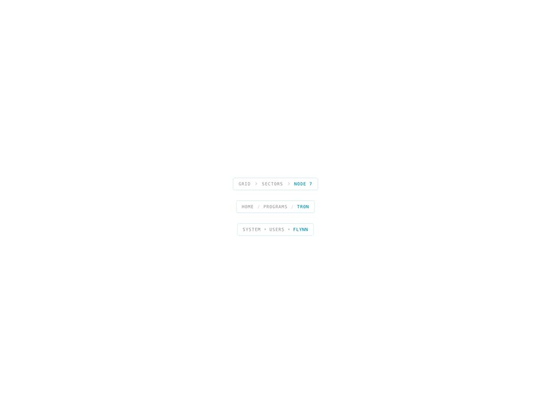
A compact breadcrumb navigation trail with chevron, slash, or dot separators and an active-page indicator.
Built with React and Tailwind. Copy the prompt and paste it into Claude Code, Cursor or Lovable: your agent adds Breadcrumb Nav to your project and fits it to your theme.
Code
How Breadcrumb Nav is used: the demo's code. The component's own source comes with a free account.
Usage.tsx
import { BreadcrumbNav } from "@/components/ui/breadcrumb-nav";

export default function Default() {
  return (
    <div className="flex min-h-[280px] w-full flex-col items-center justify-center gap-6 bg-background p-10">
      <BreadcrumbNav
        items={[
          { label: "Grid", href: "#" },
          { label: "Sectors", href: "#" },
          { label: "Node 7", active: true },
        ]}
      />
      <BreadcrumbNav
        separator="slash"
        items={[
          { label: "Home", href: "#" },
          { label: "Programs", href: "#" },
          { label: "Tron", active: true },
        ]}
      />
      <BreadcrumbNav
        separator="dot"
        items={[
          { label: "System", href: "#" },
          { label: "Users", href: "#" },
          { label: "Flynn", active: true },
        ]}
      />
    </div>
  );
}
More by thegridcn
View all
Energy Meter
77
Waveform
55
Data Stream
52
CTA Banner
23
Video Player
22
Terminal
13
3D Tron Grid Background
7
Pagination
7
More in Navigation
View all

Sidebar
235
Navbar with Theme Toggle
43

Tabs
60

Sidebar
340
Numberless Pagination with Text
11
Oversized 404 Numeral
50
Footer
446
Pagination
43


