About
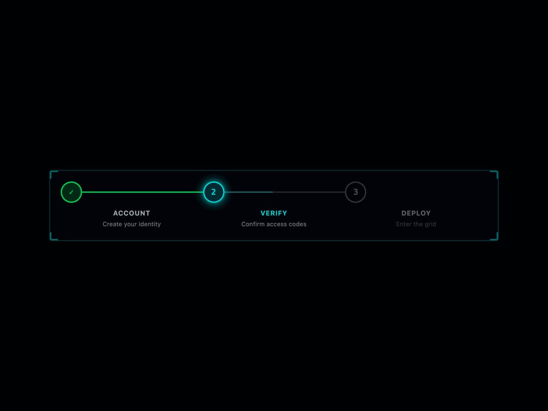
A step progress indicator that shows numbered stages with connector lines, marking completed, active, and upcoming steps, styled with a neon Tron-inspired look.
Built with React and Tailwind. Copy the prompt and paste it into Claude Code, Cursor or Lovable: your agent adds Tron Stepper to your project and fits it to your theme.
Code
How Tron Stepper is used: the demo's code. The component's own source comes with a free account.
Usage.tsx
import { Stepper } from "@/components/ui/stepper";

export default function StepperDemo() {
  return (
    <div className="flex min-h-screen w-full items-center justify-center bg-background p-8">
      <Stepper
        className="w-full max-w-2xl"
        currentStep={1}
        steps={[
          { label: "Account", description: "Create your identity" },
          { label: "Verify", description: "Confirm access codes" },
          { label: "Deploy", description: "Enter the grid" },
        ]}
      />
    </div>
  );
}
More by thegridcn
View all
Energy Meter
77
Waveform
55
Data Stream
52
CTA Banner
23
Video Player
22
Terminal
13
3D Tron Grid Background
7
Pagination
7