About
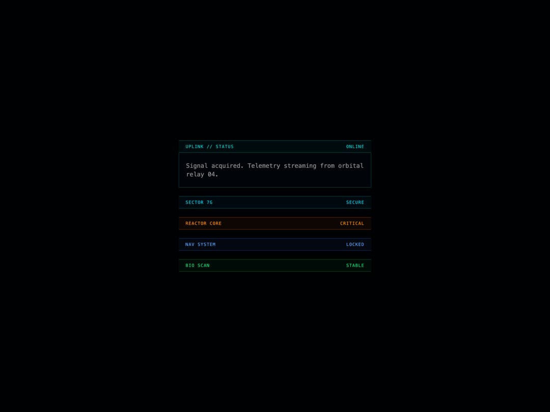
A compact monospaced header bar that shows left- and right-aligned tech-style status labels with selectable accent color variants.
Built with React and Tailwind. Copy the prompt and paste it into Claude Code, Cursor or Lovable: your agent adds Uplink Header to your project and fits it to your theme.
Code
How Uplink Header is used: the demo's code. The component's own source comes with a free account.
Usage.tsx
import { UplinkHeader } from "@/components/ui/uplink-header";

export default function Default() {
  return (
    <div className="flex min-h-[360px] w-full items-center justify-center bg-background p-8">
      <div className="w-full max-w-md space-y-5">
        <div>
          <UplinkHeader leftText="UPLINK // STATUS" rightText="ONLINE" />
          <div className="border-x border-b border-border bg-card px-4 py-5">
            <p className="font-mono text-sm text-muted-foreground">
              Signal acquired. Telemetry streaming from orbital relay 04.
            </p>
          </div>
        </div>

        <UplinkHeader leftText="SECTOR 7G" rightText="SECURE" variant="cyan" />
        <UplinkHeader
          leftText="REACTOR CORE"
          rightText="CRITICAL"
          variant="orange"
        />
        <UplinkHeader leftText="NAV SYSTEM" rightText="LOCKED" variant="blue" />
        <UplinkHeader leftText="BIO SCAN" rightText="STABLE" variant="green" />
      </div>
    </div>
  );
}
More by thegridcn
View all
Energy Meter
77
Waveform
55
Data Stream
52
CTA Banner
23
Video Player
22
Terminal
13
3D Tron Grid Background
7
Pagination
7