
About
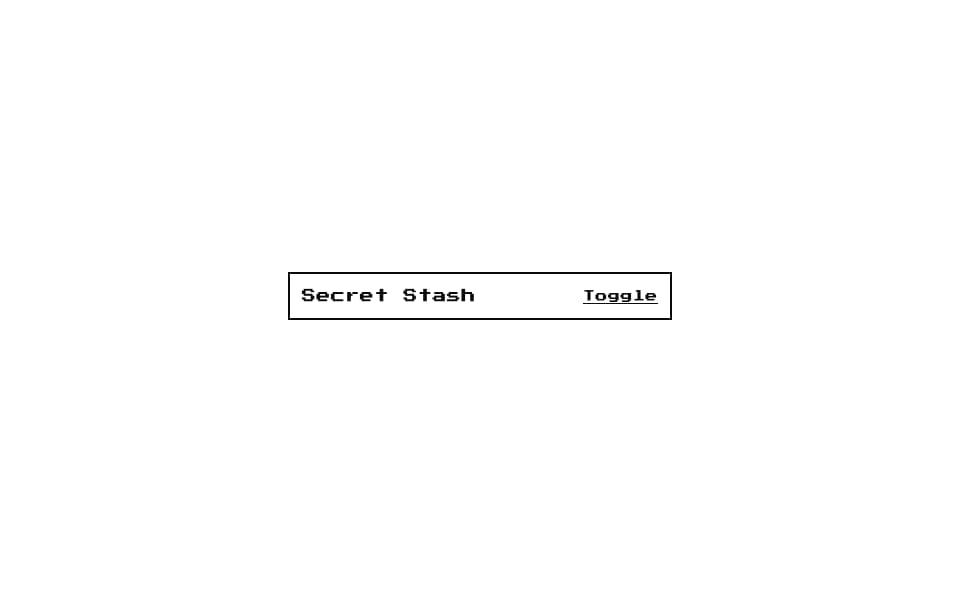
Pixel-art collapsible panel from 8bitcn.com — toggle to reveal/hide content with retro styling.
Built with React and Tailwind. Copy the prompt and paste it into Claude Code, Cursor or Lovable: your agent adds 8-bit Collapsible to your project and fits it to your theme.
Code
How 8-bit Collapsible is used: the demo's code. The component's own source comes with a free account.
Usage.tsx
"use client";

import {
  Collapsible,
  CollapsibleContent,
  CollapsibleTrigger,
} from "@/components/ui/8bit-collapsible";

export default function Default() {
  return (
    <div className="flex w-full min-h-screen items-center justify-center bg-background p-8 overflow-hidden">
      <Collapsible className="w-full max-w-sm space-y-2">
        <div className="flex items-center justify-between border-2 border-foreground p-3">
          <span className="text-sm font-pixel">Secret Stash</span>
          <CollapsibleTrigger className="text-xs font-pixel underline">
            Toggle
          </CollapsibleTrigger>
        </div>
        <CollapsibleContent className="space-y-2">
          <div className="border-2 border-foreground p-3 font-pixel text-sm">Gold ×999</div>
          <div className="border-2 border-foreground p-3 font-pixel text-sm">Phoenix Down ×3</div>
          <div className="border-2 border-foreground p-3 font-pixel text-sm">Megalixir ×1</div>
        </CollapsibleContent>
      </Collapsible>
    </div>
  );
}
Dependencies
More by OrcDev
View all
8bit CTA 1 — Comparison
295
8bit 404 Page
172
8bit Loading Screen
104
8bit Changelog
75
8-bit Login Form
59
8bit FAQ 2 — Card Grid
57
8-bit Stats Dashboard
55
8bit Timeline Horizontal
54