About
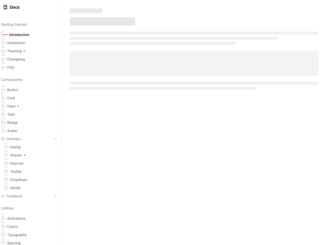
Animated vertical sidebar navigation with a spring hover highlight, an animated active indicator bar, collapsible groups, per-item dash accents, and drag-to-resize.
Built with React and Tailwind. Copy the prompt and paste it into Claude Code, Cursor or Lovable: your agent adds Animated Sidebar to your project and fits it to your theme.
Code
How Animated Sidebar is used: the demo's code. The component's own source comes with a free account.
Usage.tsx
"use client";

import {
  Sidebar001,
  Sidebar001Content,
  Sidebar001Footer,
  Sidebar001Group,
  Sidebar001Header,
  Sidebar001Item,
  Sidebar001Section,
} from "@/components/ui/sidebar-001";
import * as React from "react";
import { Bell, BookMarked, Layers } from "lucide-react";

const NAV = [
  {
    label: "Getting Started",
    items: [
      { href: "/docs/introduction", label: "Introduction" },
      { href: "/docs/installation", label: "Installation" },
      { href: "/docs/theming", label: "Theming", isNew: true },
      { href: "/docs/changelog", label: "Changelog" },
      { href: "/docs/faq", label: "FAQ" },
    ],
  },
  {
    label: "Components",
    items: [
      { href: "/docs/button", label: "Button" },
      { href: "/docs/card", label: "Card" },
      { href: "/docs/input", label: "Input", isNew: true },
      { href: "/docs/tabs", label: "Tabs" },
      { href: "/docs/badge", label: "Badge" },
      { href: "/docs/avatar", label: "Avatar" },
    ],
    groups: [
      {
        label: "Overlays",
        defaultOpen: true,
        icon: <Layers />,
        items: [
          { href: "/docs/dialog", label: "Dialog" },
          { href: "/docs/drawer", label: "Drawer", isNew: true },
          { href: "/docs/popover", label: "Popover" },
          { href: "/docs/tooltip", label: "Tooltip" },
          { href: "/docs/dropdown", label: "Dropdown" },
          { href: "/docs/modal", label: "Modal" },
        ],
      },
      {
        label: "Feedback",
        defaultOpen: false,
        icon: <Bell />,
        items: [
          { href: "/docs/toast", label: "Toast", isNew: true },
          { href: "/docs/alert", label: "Alert" },
          { href: "/docs/progress", label: "Progress" },
          { href: "/docs/skeleton", label: "Skeleton" },
          { href: "/docs/spinner", label: "Spinner" },
        ],
      },
    ],
  },
  {
    label: "Utilities",
    items: [
      { href: "/docs/animations", label: "Animations" },
      { href: "/docs/colors", label: "Colors" },
      { href: "/docs/typography", label: "Typography" },
      { href: "/docs/spacing", label: "Spacing" },
    ],
  },
  {
    label: "Resources",
    items: [
      { href: "/docs/accessibility", label: "Accessibility" },
      { href: "/docs/performance", label: "Performance" },
      { href: "/docs/best-practices", label: "Best Practices" },
      { href: "/docs/examples", label: "Examples" },
    ],
  },
];

export default function Sidebar001Demo() {
  const [active, setActive] = React.useState("/docs/introduction");

  return (
    <div className="flex h-full w-full overflow-hidden bg-background">
      <Sidebar001>
        <Sidebar001Header>
          <div className="flex items-center gap-2">
            <BookMarked size={18} />
            <span className="text-base font-semibold text-foreground">
              Docs
            </span>
          </div>
        </Sidebar001Header>
        <Sidebar001Content>
          {NAV.map((section) => (
            <Sidebar001Section key={section.label} label={section.label}>
              {section.items.map((item) => (
                <Sidebar001Item
                  key={item.href}
                  href={item.href}
                  label={item.label}
                  isActive={active === item.href}
                  isNew={item.isNew}
                  onClick={(e) => {
                    e.preventDefault();
                    setActive(item.href);
                  }}
                />
              ))}
              {section.groups?.map((group) => (
                <Sidebar001Group
                  key={group.label}
                  label={group.label}
                  defaultOpen={group.defaultOpen}
                  icon={group.icon}
                >
                  {group.items.map((item) => (
                    <Sidebar001Item
                      key={item.href}
                      href={item.href}
                      label={item.label}
                      isActive={active === item.href}
                      isNew={item.isNew}
                      onClick={(e) => {
                        e.preventDefault();
                        setActive(item.href);
                      }}
                    />
                  ))}
                </Sidebar001Group>
              ))}
            </Sidebar001Section>
          ))}
        </Sidebar001Content>
        <Sidebar001Footer>
          <span className="text-xs text-foreground/40">v1.0.0</span>
        </Sidebar001Footer>
      </Sidebar001>

      <div className="flex-1 flex flex-col gap-4 p-8 border-l border-border/50 overflow-y-auto no-scrollbar">
        <div className="h-5 w-32 rounded bg-foreground/8" />
        <div className="h-8 w-64 rounded bg-foreground/10" />
        <div className="flex flex-col gap-2 mt-2">
          <div className="h-3 w-full rounded bg-foreground/6" />
          <div className="h-3 w-5/6 rounded bg-foreground/6" />
          <div className="h-3 w-4/6 rounded bg-foreground/6" />
        </div>
        <div className="h-24 w-full rounded-lg bg-foreground/5 mt-2" />
        <div className="flex flex-col gap-2 mt-2">
          <div className="h-3 w-full rounded bg-foreground/6" />
          <div className="h-3 w-3/4 rounded bg-foreground/6" />
        </div>
      </div>
    </div>
  );
}
Dependencies
More by unlumen
View all
Motion Navigation Menu
271
Side By Side Slide
226
Scroll Reveal Image
222
Count Up
144
Pixel Liquid Background
104
Glow Button
97
Horizontal Depth Fade
77
LED Dot Matrix Display
70
More in Navigation
View all

Sidebar
230

Tabs
60
Progress Bar Stepper
36
Newsletter Signup Footer
15

Footer 2
200
Navbar with Theme Toggle
43
Numberless Pagination with Text
11

Navbar
71
