
About
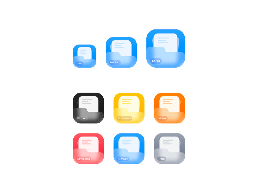
A folder icon component with a frosted glass front flap, stacked document peek, and smooth spring hover animation that fans the papers open. Pick from 6 color themes via the prop. Drop it into any React or Next.js project and install directly via the shadcn CLI.
Built with React and Tailwind. Copy the prompt and paste it into Claude Code, Cursor or Lovable: your agent adds Folder Components to your project and fits it to your theme.
Code
How Folder Components is used: the demo's code. The component's own source comes with a free account.
Usage.tsx
import { Folder } from "@/components/ui/folder-components";

export default function DemoOne() {
  return (
    <div className="flex">
      <Folder label="Components" />
    </div>
  );
}
Dependencies
More by Faisal Amir
View all
File Card Collections
1K