
About
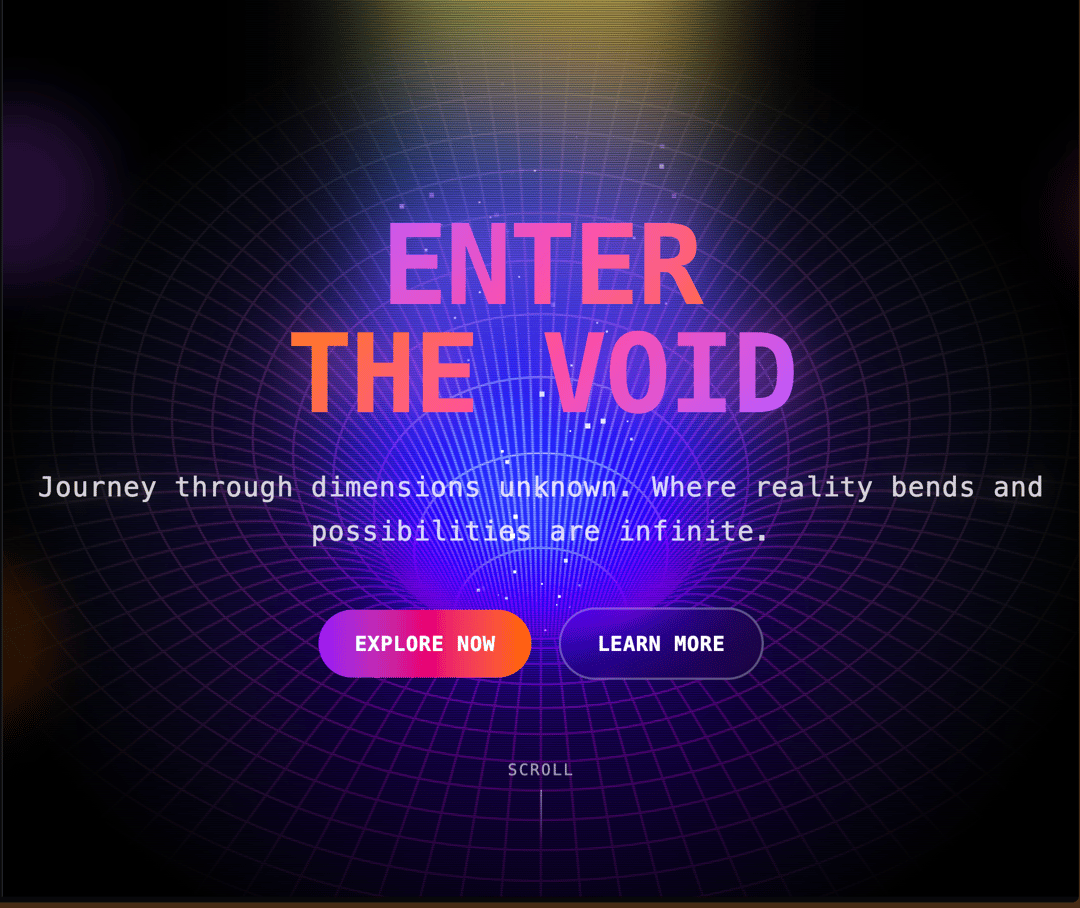
A fullscreen hero section featuring a dynamic, theme-aware canvas background animation. Ideal for impactful landing pages and product showcases.
Built with React and Tailwind. Copy the prompt and paste it into Claude Code, Cursor or Lovable: your agent adds Animated Hero to your project and fits it to your theme.
Code
How Animated Hero is used: the demo's code. The component's own source comes with a free account.
Usage.tsx
import AnimatedBackground from "@/components/ui/animated-hero";

const HeroSection: React.FC = () => {
  return (
    <section className="relative w-screen h-screen bg-gray-900 flex items-center justify-center overflow-hidden">
      {/* Animated Background */}
      <AnimatedBackground />

      {/* Hero Content */}
      <div className="relative z-50 text-center px-4 max-w-6xl mx-auto">
        {/* Main Headline */}
        <div className="mb-8 space-y-4">
          <h1
            className="text-6xl md:text-8xl lg:text-9xl font-black tracking-tight leading-none"
            style={{
              fontFamily: '"Martian Mono", monospace',
              background: 'linear-gradient(135deg, #ffffff 0%, #a855f7 25%, #ec4899 50%, #f97316 75%, #eab308 100%)',
              WebkitBackgroundClip: 'text',
              WebkitTextFillColor: 'transparent',
              backgroundClip: 'text',
              textShadow: '0 0 40px rgba(168, 85, 247, 0.3)',
              animation: 'glow-pulse 3s ease-in-out infinite alternate'
            }}
          >
            ENTER
          </h1>
          <h1
            className="text-6xl md:text-8xl lg:text-9xl font-black tracking-tight leading-none -mt-4"
            style={{
              fontFamily: '"Martian Mono", monospace',
              background: 'linear-gradient(135deg, #eab308 0%, #f97316 25%, #ec4899 50%, #a855f7 75%, #ffffff 100%)',
              WebkitBackgroundClip: 'text',
              WebkitTextFillColor: 'transparent',
              backgroundClip: 'text',
              textShadow: '0 0 40px rgba(236, 72, 153, 0.3)',
              animation: 'glow-pulse 3s ease-in-out infinite alternate 1.5s'
            }}
          >
            THE VOID
          </h1>
        </div>

        {/* Subtitle */}
        <div className="mb-12">
          <p
            className="text-xl md:text-2xl lg:text-3xl font-light tracking-wide text-white/80 max-w-4xl mx-auto leading-relaxed"
            style={{
              fontFamily: '"Martian Mono", monospace',
              textShadow: '0 0 20px rgba(255, 255, 255, 0.2)',
              animation: 'fade-in-up 2s ease-out 0.5s both'
            }}
          >
            Journey through dimensions unknown. Where reality bends and possibilities are infinite.
          </p>
        </div>

        {/* CTA Buttons */}
        <div
          className="flex flex-col sm:flex-row gap-6 justify-center items-center"
          style={{
            animation: 'fade-in-up 2s ease-out 1s both'
          }}
        >
          <button
            className="group relative px-8 py-4 bg-gradient-to-r from-purple-600 via-pink-600 to-orange-500 rounded-full font-bold text-white text-lg tracking-wide transition-all duration-300 hover:shadow-[0_0_40px_rgba(168,85,247,0.6)] hover:scale-105 active:scale-95 overflow-hidden"
            style={{ fontFamily: '"Martian Mono", monospace' }}
          >
            <span className="relative z-10">EXPLORE NOW</span>
            <div className="absolute inset-0 bg-gradient-to-r from-orange-500 via-pink-600 to-purple-600 opacity-0 group-hover:opacity-100 transition-opacity duration-300"></div>
          </button>

          <button
            className="group relative px-8 py-4 bg-transparent border-2 border-white/30 rounded-full font-bold text-white text-lg tracking-wide transition-all duration-300 hover:border-purple-400 hover:shadow-[0_0_30px_rgba(168,85,247,0.4)] hover:bg-white/10 backdrop-blur-sm"
            style={{ fontFamily: '"Martian Mono", monospace' }}
          >
            LEARN MORE
          </button>
        </div>

        {/* Floating Elements */}
        <div className="absolute -top-20 -left-20 w-40 h-40 bg-purple-500/20 rounded-full blur-xl animate-bounce" style={{ animationDelay: '0s', animationDuration: '6s' }}></div>
        <div className="absolute -top-10 -right-32 w-32 h-32 bg-pink-500/20 rounded-full blur-xl animate-bounce" style={{ animationDelay: '2s', animationDuration: '8s' }}></div>
        <div className="absolute -bottom-16 -left-28 w-36 h-36 bg-orange-500/20 rounded-full blur-xl animate-bounce" style={{ animationDelay: '4s', animationDuration: '7s' }}></div>
      </div>

      {/* Scroll Indicator */}
      <div
        className="absolute bottom-8 left-1/2 transform -translate-x-1/2 z-50 text-white/60 animate-bounce"
        style={{ animationDuration: '2s' }}
      >
        <div className="flex flex-col items-center space-y-2">
          <span className="text-sm font-light tracking-widest" style={{ fontFamily: '"Martian Mono", monospace' }}>
            SCROLL
          </span>
          <div className="w-px h-12 bg-gradient-to-b from-white/60 to-transparent"></div>
        </div>
      </div>

      {/* Custom Animations */}
      <style jsx>{`
        @keyframes glow-pulse {
          0% {
            filter: brightness(1) drop-shadow(0 0 20px rgba(168, 85, 247, 0.3));
            transform: scale(1);
          }
          100% {
            filter: brightness(1.1) drop-shadow(0 0 40px rgba(168, 85, 247, 0.6));
            transform: scale(1.02);
          }
        }

        @keyframes fade-in-up {
          0% {
            opacity: 0;
            transform: translateY(40px);
          }
          100% {
            opacity: 1;
            transform: translateY(0);
          }
        }
      `}</style>
    </section>
  );
};

export default HeroSection;More by Vaibhav Kumar Singh
View all
Stagger Testimonials
2K
Event Manager
1.6K
Expanding Cards
1.4K
FAQ tabs
1.2K
Shuffle Grid
1K
Flip Links
1K
Category List
820
Color Change Card
761
More in Heroes
View all

SaaS Template
2.4K
Centered Hero with Image Fan
924

Hero
1.2K

Responsive Hero Banner
2K

Hero Section 6
881
Hero Golden Spiral
101

Minimalist Hero Fashion
284

Home Section
65
