
About
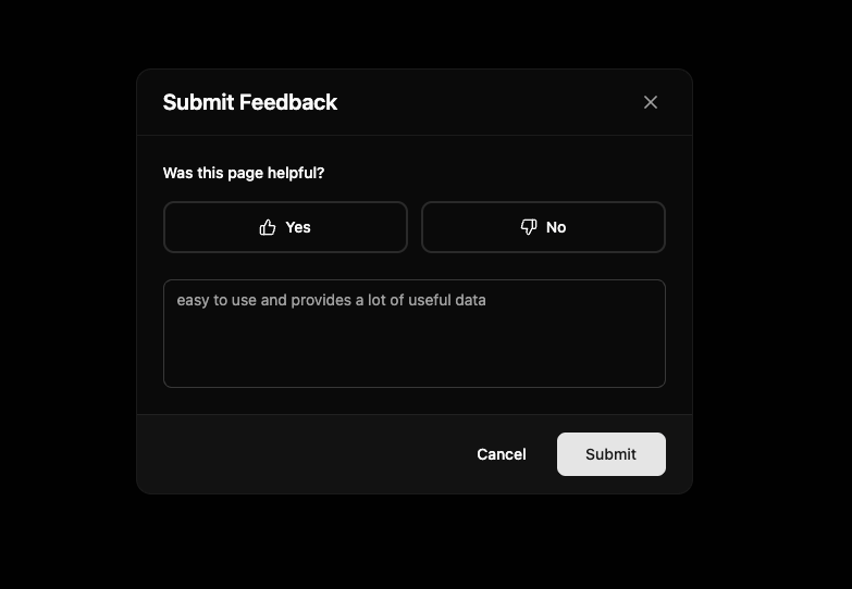
A polished feedback modal component with an enhanced UI that takes inspiration from the Mixpanel design. The component features smooth animations, a clean layout with thumbs up/down buttons, an optional comment textarea, and a success state with confirmation.
Built with React and Tailwind. Copy the prompt and paste it into Claude Code, Cursor or Lovable: your agent adds Feedback Modal to your project and fits it to your theme.
Code
How Feedback Modal is used: the demo's code. The component's own source comes with a free account.
Usage.tsx
import { useState } from "react"
import { FeedbackModal } from "@/components/ui/feedback-modal"
import { Button } from "@/components/ui/button"

export default function DemoOne() {
  const [isOpen, setIsOpen] = useState(false)

  return <>
    <Button onClick={() => setIsOpen(true)} size="lg" className="w-full sm:w-auto">
              Open Feedback Modal
            </Button>
  <FeedbackModal
        isOpen={isOpen}
        onClose={() => setIsOpen(false)}
        title="Submit Feedback"
        question="Was this page helpful?"
        placeholder="easy to use and provides a lot of useful data"
        onSubmit={(data) => {
          console.log("Feedback submitted:", data)
        }}
      />
  </>;
}
Dependencies
More by Vaibhav Kumar Singh
View all
Stagger Testimonials
2K
Event Manager
1.6K
Expanding Cards
1.4K
FAQ tabs
1.2K
Shuffle Grid
1K
Flip Links
1K
Category List
821
Color Change Card
762
More in Forms
View all

Premium Auth
500

Login 1
52

Book A Demo 3
83
Authentication Card
47
Book A Demo 1
69

Contact Card
1K

Login Card
32

Login 2
7
