
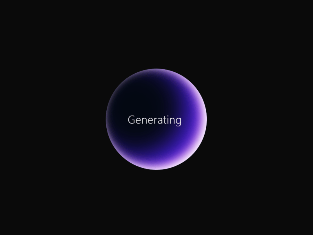
Generating Loader A clean and modern loading animation that shows a glowing circle with the word “Generating” in the center. The loader combines a smooth rotating highlight with a subtle text shimmer, making it feel active without being distracting. This component is easy to customize — you can change the size, speed, colors, background, and font to match your project. It’s built with pure React and CSS, no extra dependencies, and includes accessibility support (reduced-motion friendly). Perfect for AI apps, content creation tools, dashboards, or any project where you need to show users that something is being generated or processed.
Built with React and Tailwind. Copy the prompt and paste it into Claude Code, Cursor or Lovable: your agent adds Generating loader to your project and fits it to your theme.
Code
How Generating loader is used: the demo's code. The component's own source comes with a free account.
Usage.tsx
import { Component } from "@/components/ui/generating-loader";

export default function DemoOne() {
  return <Component />;
}
More by waiz
View all

SaaS Template
2.4K
image auto slider
1.8K
Silk-Background-animation
925
Portfolio Hero
885
Gradient bars Background
589
Glow Button
384
Spotlight Button
380
Gradient Bar hero section
343