
About
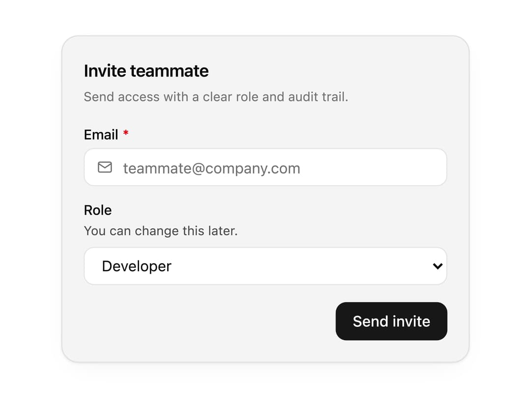
A composable form field wrapper that pairs any control with a label, helper description, required marker and inline error. Use it to build consistent signup, settings and checkout forms.
Built with React and Tailwind. Copy the prompt and paste it into Claude Code, Cursor or Lovable: your agent adds Form Field to your project and fits it to your theme.
Code
How Form Field is used: the demo's code. The component's own source comes with a free account.
Usage.tsx
"use client";

import * as React from "react";
import { IconMail, IconShieldLock, IconUser, IconUsers } from "@tabler/icons-react";
import { FormActions, FormField, FormFieldControl } from "@/components/ui/form-field";

import { clsx, type ClassValue } from "clsx";
import { twMerge } from "tailwind-merge";

function cn(...inputs: ClassValue[]) {
  return twMerge(clsx(inputs));
}

const Button = React.forwardRef<
  HTMLButtonElement,
  React.ButtonHTMLAttributes<HTMLButtonElement> & {
    variant?: "primary" | "secondary" | "ghost";
    leftIcon?: React.ReactNode;
  }
>(function Button({ variant = "primary", leftIcon, className, children, ...props }, ref) {
  return (
    <button
      ref={ref}
      type="button"
      className={cn(
        "inline-flex h-9 items-center justify-center gap-2 rounded-[10px] px-4 text-sm font-medium outline-none transition-colors focus-visible:ring-2 focus-visible:ring-[var(--ring)] [&_svg]:size-4",
        variant === "primary" && "bg-[var(--primary)] text-[var(--primary-foreground)] hover:opacity-90",
        variant === "secondary" && "border border-[var(--border)] bg-[var(--background)] text-[var(--foreground)] hover:bg-[var(--muted)]",
        variant === "ghost" && "text-[var(--foreground)] hover:bg-[var(--muted)]",
        className,
      )}
      {...props}
    >
      {leftIcon}
      {children}
    </button>
  );
});

const Input = React.forwardRef<
  HTMLInputElement,
  React.InputHTMLAttributes<HTMLInputElement> & { leftIcon?: React.ReactNode }
>(function Input({ leftIcon, className, ...props }, ref) {
  return (
    <div className="relative flex items-center">
      {leftIcon && (
        <span className="pointer-events-none absolute left-3 text-[var(--muted-foreground)] [&_svg]:size-4">
          {leftIcon}
        </span>
      )}
      <input
        ref={ref}
        className={cn(
          "h-9 w-full rounded-[10px] border border-[var(--border)] bg-[var(--background)] px-3 text-sm text-[var(--foreground)] outline-none placeholder:text-[var(--muted-foreground)] focus-visible:ring-2 focus-visible:ring-[var(--ring)]",
          leftIcon && "pl-9",
          className,
        )}
        {...props}
      />
    </div>
  );
});

function Select({
  defaultValue,
  options,
}: {
  defaultValue?: string;
  options: { label: string; options: { label: string; value: string }[] }[];
}) {
  return (
    <select
      defaultValue={defaultValue}
      className="h-9 w-full rounded-[10px] border border-[var(--border)] bg-[var(--background)] px-3 text-sm text-[var(--foreground)] outline-none focus-visible:ring-2 focus-visible:ring-[var(--ring)]"
    >
      {options.map((group) => (
        <optgroup key={group.label} label={group.label}>
          {group.options.map((option) => (
            <option key={option.value} value={option.value}>
              {option.label}
            </option>
          ))}
        </optgroup>
      ))}
    </select>
  );
}

const primitivePreviewCardSurfaceFrameClass = cn(
  "relative isolate overflow-hidden rounded-2xl",
  "border",
);

const primitivePreviewCardSurfaceLightClass = cn(
  "border-black/[0.08] bg-[#f4f4f5]",
  "[box-shadow:0_1px_2px_rgba(0,0,0,.06),0_8px_24px_-12px_rgba(0,0,0,.08)]",
);

const primitivePreviewCardSurfaceClass = cn(
  primitivePreviewCardSurfaceFrameClass,
  primitivePreviewCardSurfaceLightClass,
  // Full static `dark:bg-[#0a0a0b]` kept for Tailwind content scan - same as
  // PRIMITIVE_PREVIEW_CANVAS_DARK_BG / PRIMITIVE_PREVIEW_CANVAS_DARK.
  "dark:border-white/[0.06] dark:bg-[#0a0a0b] dark:[box-shadow:0_1px_2px_rgba(0,0,0,.4),0_8px_24px_-12px_rgba(0,0,0,.6)]",
);

const wensityCardSurfaceClass = primitivePreviewCardSurfaceClass;

function PreviewPanel({
  children,
  className,
}: {
  children: React.ReactNode;
  className?: string;
}) {
  return (
    <div
      className={cn(
        wensityCardSurfaceClass,
        "w-full max-w-md p-5",
        className,
      )}
    >
      {children}
    </div>
  );
}

function PanelHeader({
  title,
  description,
}: {
  title: string;
  description?: string;
}) {
  return (
    <div className="mb-5">
      <h3 className="text-base font-semibold tracking-[-0.02em] text-[var(--foreground)]">
        {title}
      </h3>
      {description ? (
        <p className="mt-1 text-[12px] leading-[1.5] text-[var(--muted-foreground)]">
          {description}
        </p>
      ) : null}
    </div>
  );
}

const roleOptions = [
  {
    label: "Workspace",
    options: [
      {
        value: "admin",
        label: "Admin",
        description: "Manage members, billing, and releases.",
        leading: <IconShieldLock stroke={1.75} />,
      },
      {
        value: "developer",
        label: "Developer",
        description: "Create tokens and ship components.",
        leading: <IconUser stroke={1.75} />,
      },
    ],
  },
  {
    label: "Limited",
    options: [
      {
        value: "viewer",
        label: "Viewer",
        description: "Browse docs, previews, and downloads.",
        leading: <IconUsers stroke={1.75} />,
      },
    ],
  },
];

export function FormFieldPreview() {
  return (
    <PreviewPanel className="max-w-sm">
      <PanelHeader
        title="Invite teammate"
        description="Send access with a clear role and audit trail."
      />
      <div className="space-y-4">
        <FormField label="Email" required>
          <FormFieldControl asChild>
            <Input
              type="email"
              placeholder="teammate@company.com"
              leftIcon={<IconMail stroke={1.75} />}
            />
          </FormFieldControl>
        </FormField>
        <FormField label="Role" description="You can change this later.">
          <FormFieldControl asChild>
            <Select defaultValue="developer" options={roleOptions} />
          </FormFieldControl>
        </FormField>
        <FormActions>
          <Button>Send invite</Button>
        </FormActions>
      </div>
    </PreviewPanel>
  );
}

export default function Demo() {
  return <FormFieldPreview />;
}