
✔️ ContainerScroll component props: accepts react html attributes ✔️ ContainerStagger component: staggers/delayed the animated children by default <<transition staggerChildren is set to 0.2>> accepts html motion props ✔️ ContainerAnimated component: (⚠️ to get orchestrated animations make sure to make it inside <ContainerStagger /> component) accepts "animation" prop define the animation set type: "left" | "right" | "top" | "bottom" | "z" | "blur" | undefined (set to opacity by default), accepts html motion props ✔️ ContainerInset component: { translateYRange?: [string, string] 👉 default:["-25%", "50%"] insetYRange?: [number, number] 👉 default: [35, 0] insetXRange?: [number, number] 👉 default:👉 default :[35, 0] roundednessRange?: [number, number] 👉 default: [1000, 16] } ⚠️ <ContainerInset /> can be used only inside <ContainerScroll /> component
Built with React and Tailwind. Copy the prompt and paste it into Claude Code, Cursor or Lovable: your agent adds Hero Video to your project and fits it to your theme.
Code
How Hero Video is used: the demo's code. The component's own source comes with a free account.
Usage.tsx
import { ContainerAnimated,
ContainerInset,
ContainerScroll,
ContainerStagger, } from "@/components/blocks/hero-video"
import { Button } from "@/components/ui/button"
const DemoVariant1 = () => {
return (
<ContainerScroll className="bg-stone-100 text-center text-stone-800">
<ContainerStagger viewport={{ once: false }}>
<ContainerAnimated animation="top">
<h1 className=" text-4xl font-black leading-none tracking-tighter">
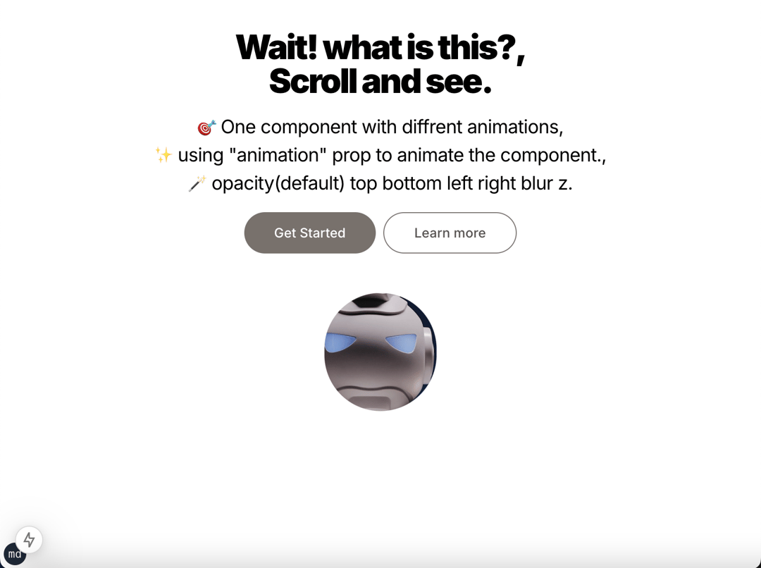
Wait! what is this?,
</h1>
</ContainerAnimated>
<ContainerAnimated animation="bottom">
<h1 className=" text-4xl font-black leading-none tracking-tighter">
Scroll and see.
</h1>
</ContainerAnimated>
<ContainerAnimated animation="blur" className="my-4">
<p className=" text-xl leading-normal tracking-tight">
🎯 One component with diffrent animations,
<br />
✨ using "animation" prop to animate the component.,
<br />
🪄 opacity(default) top bottom left right blur z.
</p>
</ContainerAnimated>
<ContainerAnimated
animation="blur"
className="flex justify-center gap-2"
>
<Button
variant={"secondary"}
className="rounded-full bg-stone-500 text-white hover:bg-stone-400"
size="lg"
>
Get Started
</Button>
<Button
variant={"outline"}
className="rounded-full border-stone-500 text-stone-600 hover:bg-stone-300"
size="lg"
>
Learn more
</Button>
</ContainerAnimated>
</ContainerStagger>
<ContainerInset className=" mx-8">
<video
width="100%"
height="100%"
loop
playsInline
autoPlay
muted
className="relative z-10 block h-auto max-h-full max-w-full object-contain align-middle"
>
<source
src="https://cdn.21st.dev/assets/mirror/8f/8face727d1504c6ccebd873ec9ce02cd34fd7c8b5be6833f410168115a377b6b.mp4"
type="video/mp4"
/>
</video>
</ContainerInset>
</ContainerScroll>
)
}
const DemoVariant2 = () => {
return (
<ContainerScroll
style={{
background: "#434343",
backgroundImage: "linear-gradient(to right, #434343 0%, #000 100%)",
}}
className="text-center text-stone-100"
>
<ContainerStagger>
<ContainerAnimated animation="top">
<h1 className=" text-4xl font-black leading-none tracking-tighter">
Wait! what is this?,
</h1>
</ContainerAnimated>
<ContainerAnimated animation="top">
<h1 className=" text-4xl font-black leading-none tracking-tighter">
Scroll and see.
</h1>
</ContainerAnimated>
<ContainerAnimated animation="z" className="my-4">
<p className=" text-xl leading-normal tracking-tight">
🎯 One component with diffrent animations,
<br />
✨ using "animation" prop to animate the component.,
<br />
🪄 opacity(default) top bottom left right blur z.
</p>
</ContainerAnimated>
<ContainerAnimated
animation="bottom"
className="flex justify-center gap-2"
>
<Button
variant={"secondary"}
className="rounded-full bg-indigo-400 text-white hover:bg-indigo-300"
size="lg"
>
Get Started
</Button>
<Button
variant={"outline"}
className="rounded-full border-indigo-300 text-indigo-300 bg-transparent hover:bg-indigo-200"
size="lg"
>
Learn more
</Button>
</ContainerAnimated>
</ContainerStagger>
<ContainerInset insetXRange={[30, 0]} className=" mx-8">
<video
width="100%"
height="100%"
loop
playsInline
autoPlay
muted
className="relative z-10 block h-auto max-h-full max-w-full object-contain align-middle"
>
<source
src="https://videos.pexels.com/video-files/8086707/8086707-uhd_2560_1440_25fps.mp4"
type="video/mp4"
/>
</video>
</ContainerInset>
</ContainerScroll>
)
}
export { DemoVariant1, DemoVariant2 }Dependencies
More by YoucefBnm Bnm
View all

Animated Slideshow
2.2K
Hero Gallery Scroll Animation
1.5K
Animated Gallery
1.4K
Animated Video on Scroll
1.4K
Animated Cards Stack
1.3K
Cards Stack
1.1K
cta section with gallery
672
Card Curtain Reveal
427
More in Heroes
View all

SaaS Template
2.4K

Responsive Hero Banner
2K

Hero
1.2K
Centered Hero with Image Fan
931
Editorial Collage Hero
430
Glass Fold
212

Minimalist Hero Fashion
285

HeroSectionWithGradient
336
