
About
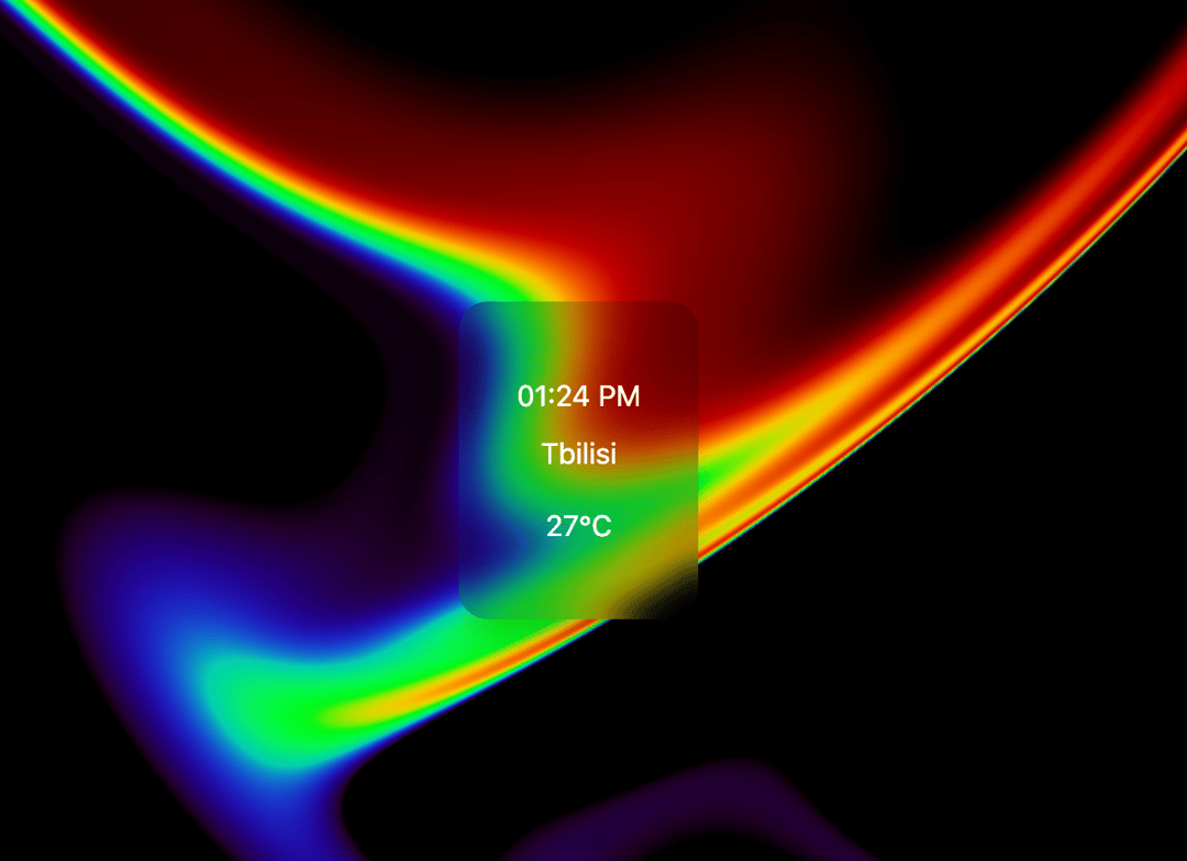
Here is Shader Clock component
Built with React and Tailwind. Copy the prompt and paste it into Claude Code, Cursor or Lovable: your agent adds Shader Clock to your project and fits it to your theme.
Code
How Shader Clock is used: the demo's code. The component's own source comes with a free account.
Usage.tsx
import { useState, useEffect } from "react";
import { ShaderBackground } from "@/components/ui/shader-clock";
import { TimeDisplay } from "@/components/ui/shader-clock";

export default function App() {
  const [showInfo, setShowInfo] = useState<boolean>(false);
  const [visible, setVisible] = useState<boolean>(false);

  // Fade in animation when component mounts
  useEffect(() => {
    const timer = setTimeout(() => {
      setVisible(true);
    }, 200);

    return () => clearTimeout(timer);
  }, []);

  return (
    <div className="relative w-screen h-screen overflow-hidden">
      {/* Shader Background */}
      <ShaderBackground />

      {/* Content Container with backdrop blur for better text readability */}
      <div className="absolute inset-0 flex flex-col items-center justify-center">
        <div
          className={`backdrop-blur-sm bg-black/20 px-8 py-10 rounded-2xl shadow-xl transition-all duration-700 ${
            visible
              ? "opacity-100 scale-100"
              : "opacity-0 scale-95"
          }`}
        >
          <TimeDisplay />
        </div>

        {/* Info Panel */}
        {showInfo && (
          <div className="absolute bottom-8 left-1/2 transform -translate-x-1/2 bg-black/40 backdrop-blur-md px-6 py-4 rounded-lg shadow-lg text-white/80 text-sm transition-all duration-300 animate-fadeIn">
            <p>Click on the city name to edit your location.</p>
            <p className="mt-1">
              Click on the temperature to toggle between °C and
              °F.
            </p>
          </div>
        )}
      </div>

      {/* Info button */}
      <button
        onClick={() => setShowInfo((prev) => !prev)}
        className={`absolute bottom-6 right-6 w-10 h-10 flex items-center justify-center rounded-full backdrop-blur-md text-white/70 hover:text-white/100 transition-all duration-300 ${
          showInfo ? "bg-black/40 rotate-180" : "bg-black/30"
        }`}
        aria-label={
          showInfo ? "Close information" : "Show information"
        }
      >
        {showInfo ? "×" : "i"}
      </button>
    </div>
  );
}More in Shaders
View all
Glass Fold
212

Neural Noise
717
Water Caustic
44
Shader Background
2K
Wave
687
Stripe like gradient-shader
265
Black Hole
23
Shader Lines
2.3K

