
About
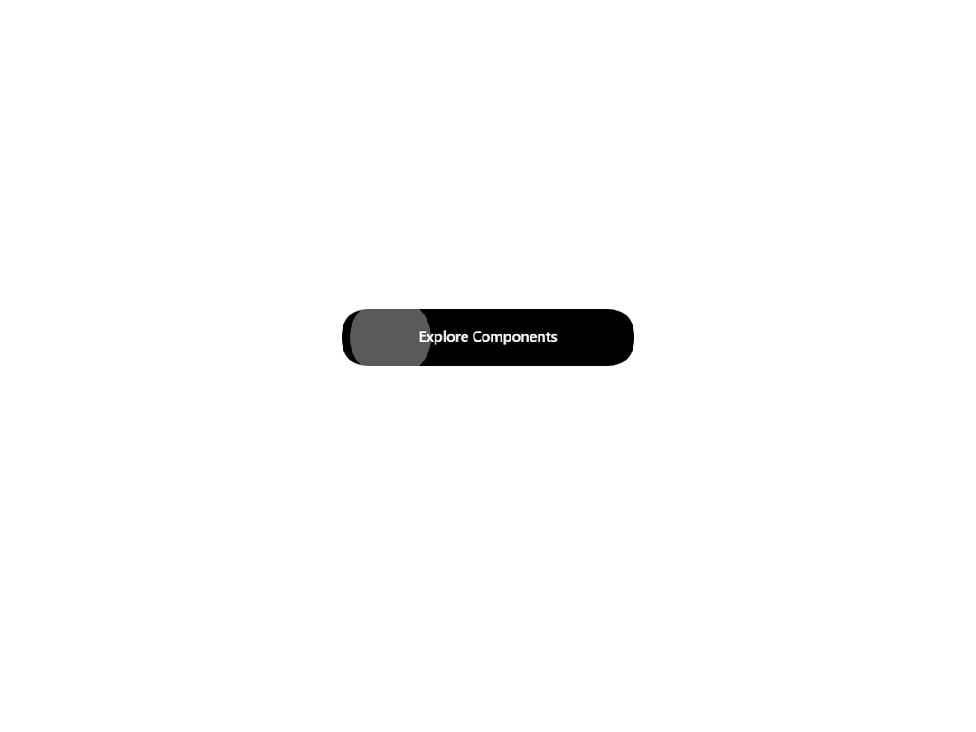
An interactive button with a circular reveal effect that follows your cursor. A white circle grows from the mouse entry point and fills the entire button on hover, with smooth entrance and exit animations.
Built with React and Tailwind. Copy the prompt and paste it into Claude Code, Cursor or Lovable: your agent adds Hover Reveal Button to your project and fits it to your theme.
Code
How Hover Reveal Button is used: the demo's code. The component's own source comes with a free account.
Usage.tsx
import { HoverRevealButton } from "@/components/ui/hover-reveal-button";

export default function HoverRevealButtonDemo() {
  return (
    <div className="bg-white rounded-xl">
      <div className="flex flex-col items-center justify-center min-h-[400px] gap-8 p-8">
        <HoverRevealButton className="px-12 py-4 text-base rounded">
          Button
        </HoverRevealButton>
      </div>
    </div>
  );
}More in Buttons
View all
Button Save
46

Button
20

Eclipse Button
5

Button
6

Button
14

Button Group
37

Button
32
Split Button
32

