
About
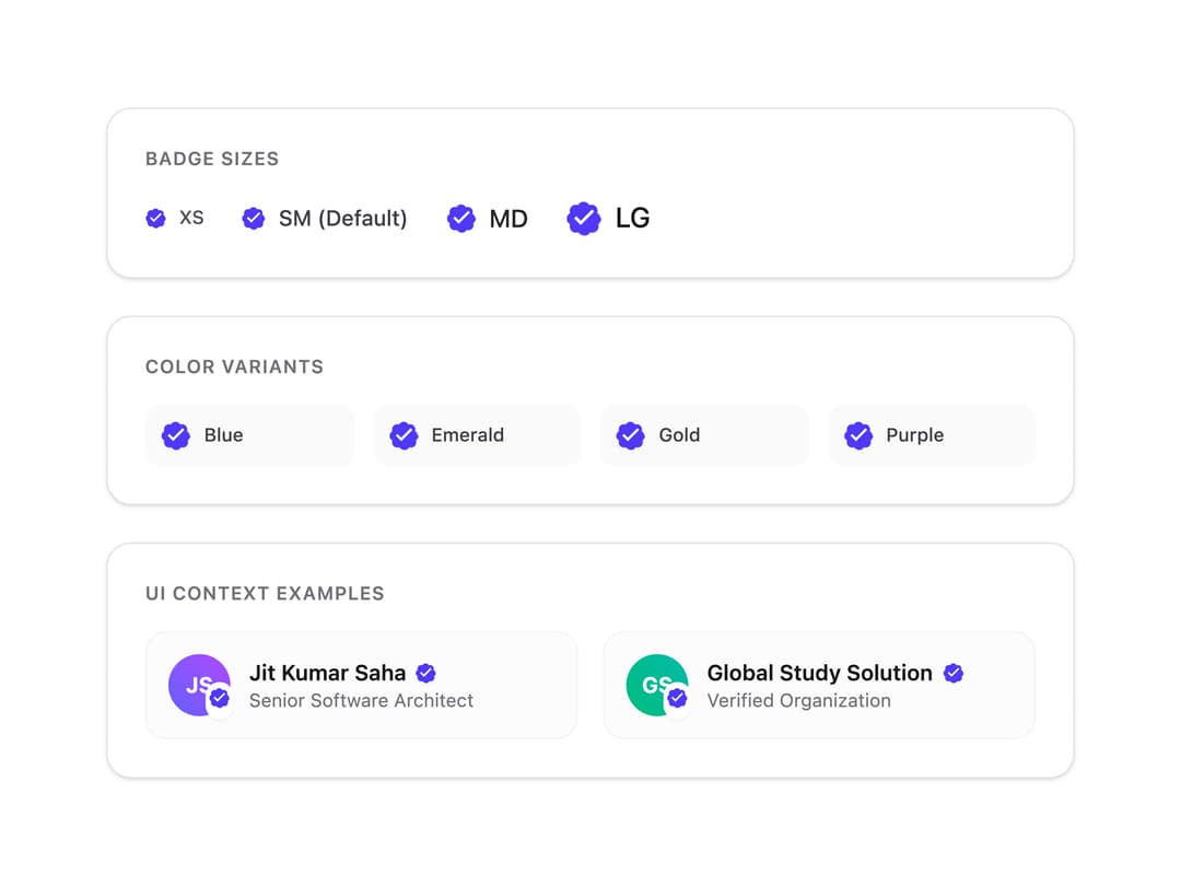
Verified account badge component with customizable size, color variants, and tooltip
Built with React and Tailwind. Copy the prompt and paste it into Claude Code, Cursor or Lovable: your agent adds Verified Badge to your project and fits it to your theme.
Code
How Verified Badge is used: the demo's code. The component's own source comes with a free account.
Usage.tsx
import React from 'react';
import { VerifiedBadge } from '@/components/ui/verified-badge';

export default function VerifiedBadgeDemo() {
  return (
    <div className="flex flex-col items-center justify-center gap-6 p-6 w-full max-w-2xl mx-auto font-sans">
      {/* Sizes Section */}
      <div className="w-full bg-white dark:bg-zinc-900 border border-zinc-200 dark:border-zinc-800 rounded-2xl p-6 shadow-sm">
        <h3 className="text-xs font-semibold uppercase tracking-wider text-zinc-500 dark:text-zinc-400 mb-4">
          Badge Sizes
        </h3>
        <div className="flex flex-wrap items-center gap-6">
          <div className="flex items-center gap-2">
            <VerifiedBadge size="xs" />
            <span className="text-xs text-zinc-600 dark:text-zinc-400 font-medium">XS</span>
          </div>
          <div className="flex items-center gap-2">
            <VerifiedBadge size="sm" />
            <span className="text-sm text-zinc-700 dark:text-zinc-300 font-medium">SM (Default)</span>
          </div>
          <div className="flex items-center gap-2">
            <VerifiedBadge size="md" />
            <span className="text-base text-zinc-800 dark:text-zinc-200 font-medium">MD</span>
          </div>
          <div className="flex items-center gap-2">
            <VerifiedBadge size="lg" />
            <span className="text-lg text-zinc-900 dark:text-zinc-100 font-medium">LG</span>
          </div>
        </div>
      </div>

      {/* Colors & Custom Styling */}
      <div className="w-full bg-white dark:bg-zinc-900 border border-zinc-200 dark:border-zinc-800 rounded-2xl p-6 shadow-sm">
        <h3 className="text-xs font-semibold uppercase tracking-wider text-zinc-500 dark:text-zinc-400 mb-4">
          Color Variants
        </h3>
        <div className="grid grid-cols-2 sm:grid-cols-4 gap-3">
          <div className="flex items-center gap-2 p-2.5 rounded-lg bg-zinc-50 dark:bg-zinc-800/50">
            <VerifiedBadge size="md" className="text-blue-500 dark:text-blue-400" />
            <span className="text-xs font-medium text-zinc-700 dark:text-zinc-300">Blue</span>
          </div>
          <div className="flex items-center gap-2 p-2.5 rounded-lg bg-zinc-50 dark:bg-zinc-800/50">
            <VerifiedBadge size="md" className="text-emerald-500 dark:text-emerald-400" />
            <span className="text-xs font-medium text-zinc-700 dark:text-zinc-300">Emerald</span>
          </div>
          <div className="flex items-center gap-2 p-2.5 rounded-lg bg-zinc-50 dark:bg-zinc-800/50">
            <VerifiedBadge size="md" className="text-amber-500 dark:text-amber-400" />
            <span className="text-xs font-medium text-zinc-700 dark:text-zinc-300">Gold</span>
          </div>
          <div className="flex items-center gap-2 p-2.5 rounded-lg bg-zinc-50 dark:bg-zinc-800/50">
            <VerifiedBadge size="md" className="text-purple-500 dark:text-purple-400" />
            <span className="text-xs font-medium text-zinc-700 dark:text-zinc-300">Purple</span>
          </div>
        </div>
      </div>

      {/* Real-World Context Cards */}
      <div className="w-full bg-white dark:bg-zinc-900 border border-zinc-200 dark:border-zinc-800 rounded-2xl p-6 shadow-sm">
        <h3 className="text-xs font-semibold uppercase tracking-wider text-zinc-500 dark:text-zinc-400 mb-4">
          UI Context Examples
        </h3>
        <div className="flex flex-col sm:flex-row items-center gap-4">
          {/* Card 1 */}
          <div className="flex-1 w-full flex items-center gap-3 p-3.5 rounded-xl border border-zinc-100 dark:border-zinc-800 bg-zinc-50/50 dark:bg-zinc-800/30">
            <div className="relative w-10 h-10 rounded-full bg-gradient-to-tr from-indigo-500 to-purple-500 flex items-center justify-center text-white font-bold text-sm">
              JS
              <span className="absolute -bottom-0.5 -right-0.5 bg-white dark:bg-zinc-900 rounded-full p-0.5 shadow-xs">
                <VerifiedBadge size="xs" />
              </span>
            </div>
            <div className="min-w-0 flex-1">
              <div className="flex items-center gap-1.5">
                <span className="font-semibold text-sm text-zinc-900 dark:text-zinc-100 truncate">Jit Kumar Saha</span>
                <VerifiedBadge size="xs" className="text-indigo-600 dark:text-indigo-400" />
              </div>
              <p className="text-xs text-zinc-500 dark:text-zinc-400 truncate">Senior Software Architect</p>
            </div>
          </div>

          {/* Card 2 */}
          <div className="flex-1 w-full flex items-center gap-3 p-3.5 rounded-xl border border-zinc-100 dark:border-zinc-800 bg-zinc-50/50 dark:bg-zinc-800/30">
            <div className="relative w-10 h-10 rounded-full bg-gradient-to-tr from-emerald-500 to-teal-500 flex items-center justify-center text-white font-bold text-sm">
              GS
              <span className="absolute -bottom-0.5 -right-0.5 bg-white dark:bg-zinc-900 rounded-full p-0.5 shadow-xs">
                <VerifiedBadge size="xs" className="text-emerald-500" />
              </span>
            </div>
            <div className="min-w-0 flex-1">
              <div className="flex items-center gap-1.5">
                <span className="font-semibold text-sm text-zinc-900 dark:text-zinc-100 truncate">Global Study Solution</span>
                <VerifiedBadge size="xs" className="text-emerald-500" />
              </div>
              <p className="text-xs text-zinc-500 dark:text-zinc-400 truncate">Verified Organization</p>
            </div>
          </div>
        </div>
      </div>
    </div>
  );
}