
About
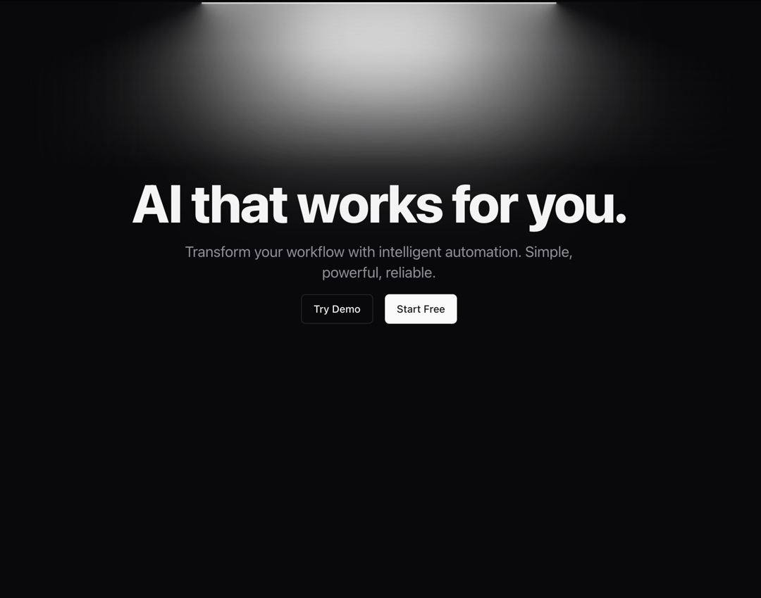
A hero section component with animated gradient background and customizable content. Features - Animated gradient background - Customizable title and subtitle - Configurable action buttons - Responsive design - Motion animations - Optional blur effect
Built with React and Tailwind. Copy the prompt and paste it into Claude Code, Cursor or Lovable: your agent adds Hero to your project and fits it to your theme.
Code
How Hero is used: the demo's code. The component's own source comes with a free account.
Usage.tsx
import { Hero } from "@/components/blocks/hero"

function HeroDemo() {
  return (
    <Hero
      title="AI that works for you."
      subtitle="Transform your workflow with intelligent automation. Simple, powerful, reliable."
      actions={[
        {
          label: "Try Demo",
          href: "#",
          variant: "outline"
        },
        {
          label: "Start Free",
          href: "#",
          variant: "default"
        }
      ]}
      titleClassName="text-5xl md:text-6xl font-extrabold"
      subtitleClassName="text-lg md:text-xl max-w-[600px]"
      actionsClassName="mt-8"
    />
  );
}

export { HeroDemo }
Dependencies
More in Heroes
View all

SaaS Template
2.4K

Responsive Hero Banner
2K

Hero
1.2K
Centered Hero with Image Fan
931
Editorial Collage Hero
430
Glass Fold
212

Minimalist Hero Fashion
285

HeroSectionWithGradient
336
