
About
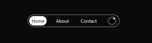
A minimal navigation bar featuring a solar-eclipse dark mode switch, blending aesthetics with functionality.
Built with React and Tailwind. Copy the prompt and paste it into Claude Code, Cursor or Lovable: your agent adds EclipseNavBar to your project and fits it to your theme.
Code
How EclipseNavBar is used: the demo's code. The component's own source comes with a free account.
Usage.tsx
import { EclipseNavBar } from "@/components/ui/eclipse-nav-bar";
import { useState, useEffect } from "react";
export default function DemoOne() {
  const [isDark, setIsDark] = useState(false)
  const items = [
    {label:"Home", link:"/"},
    {label:"About", link:"/Two"},
    {label:"Contact", link:"/Three"}
  ]
  useEffect(()=>{
    document.documentElement.classList.toggle("dark", isDark)
  },[isDark])


  return <div className='w-screen h-fit p-4 flex justify-center items-center transition-theme'>
        <EclipseNavBar setDark={()=>{setIsDark(!isDark)}} items = {items}/>
      </div>;
}
Dependencies
More in Navigation
View all

Sidebar
235
Navbar with Theme Toggle
43

Tabs
60

Sidebar
340
Numberless Pagination with Text
11
Oversized 404 Numeral
50
Footer
446
Pagination
43


