
About
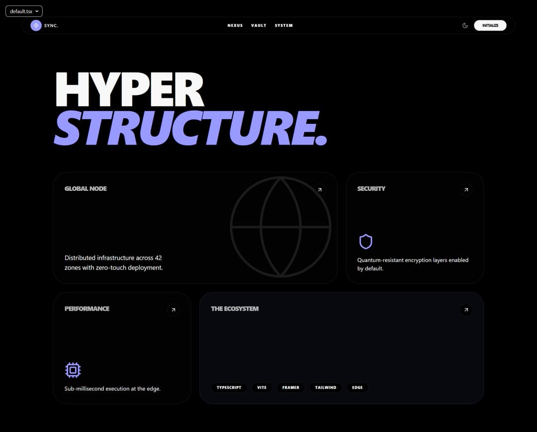
A high-contrast, bento-style landing page with a magnetic island navbar. Features cinematic GSAP-style entrance animations and ultra-responsive layout tiles
Built with React and Tailwind. Copy the prompt and paste it into Claude Code, Cursor or Lovable: your agent adds Aurora Nexus Landing to your project and fits it to your theme.
Code
How Aurora Nexus Landing is used: the demo's code. The component's own source comes with a free account.
Usage.tsx
import { Component } from "@/components/ui/aurora-nexus-landing";
import { motion } from "framer-motion";
import { Globe, Shield, Cpu, ArrowUpRight } from "lucide-react";
// ADD THIS IMPORT BELOW:
import { cn } from "@/lib/utils";

const BentoCard = ({ children, className, title }: any) => (
  <motion.div
    whileHover={{ y: -5 }}
    className={cn(
      "relative overflow-hidden rounded-[2.5rem] border border-border bg-secondary/20 p-8 group transition-colors hover:border-primary/50",
      className
    )}
  >
    <div className="relative z-10 h-full flex flex-col justify-between">
      <div className="flex justify-between items-start">
        <h3 className="text-lg font-black uppercase tracking-tighter opacity-70 group-hover:opacity-100 transition-opacity">
          {title}
        </h3>
        <div className="p-2 rounded-full bg-background border border-border group-hover:bg-primary group-hover:text-primary-foreground transition-all">
          <ArrowUpRight size={18} />
        </div>
      </div>
      <div>{children}</div>
    </div>
    {/* Animated background glow */}
    <div className="absolute inset-0 bg-gradient-to-br from-primary/10 via-transparent to-transparent opacity-0 group-hover:opacity-100 transition-opacity duration-500" />
  </motion.div>
);

export default function DemoOne() {
  return (
    <div className="w-full min-h-screen bg-background selection:bg-primary selection:text-primary-foreground">
      <Component />

      <section className="pt-48 pb-20 px-6 max-w-7xl mx-auto">
        <motion.div
          initial={{ opacity: 0, y: 30 }}
          whileInView={{ opacity: 1, y: 0 }}
          viewport={{ once: true }}
          transition={{ delay: 1.5, duration: 1 }}
          className="mb-20"
        >
          <h1 className="text-[12vw] md:text-[9vw] font-black leading-[0.8] tracking-tighter uppercase">
            Hyper <br />
            <span className="text-primary italic">Structure.</span>
          </h1>
        </motion.div>

        <div className="grid grid-cols-1 md:grid-cols-12 gap-6 auto-rows-[320px]">
          <BentoCard title="Global Node" className="md:col-span-8">
            <p className="max-w-xs text-muted-foreground text-lg">Distributed infrastructure across 42 zones with zero-touch deployment.</p>
            <div className="absolute -right-10 -bottom-10 opacity-10 group-hover:opacity-30 group-hover:rotate-12 transition-all duration-700">
              <Globe size={340} strokeWidth={0.5} />
            </div>
          </BentoCard>

          <BentoCard title="Security" className="md:col-span-4">
             <Shield size={48} className="text-primary mb-4" />
             <p className="text-muted-foreground">Quantum-resistant encryption layers enabled by default.</p>
          </BentoCard>

          <BentoCard title="Performance" className="md:col-span-4">
             <Cpu size={48} className="text-primary mb-4" />
             <p className="text-muted-foreground">Sub-millisecond execution at the edge.</p>
          </BentoCard>

          <BentoCard title="The Ecosystem" className="md:col-span-8 bg-primary/5 border-primary/20">
             <div className="flex flex-wrap gap-3 mt-auto">
                {['TypeScript', 'Vite', 'Framer', 'Tailwind', 'Edge'].map(tag => (
                  <span key={tag} className="px-4 py-1.5 rounded-full bg-background border border-border text-[10px] font-black uppercase tracking-widest group-hover:border-primary/50 transition-colors">
                    {tag}
                  </span>
                ))}
             </div>
          </BentoCard>
        </div>
      </section>
    </div>
  );
}
Dependencies
More in Heroes
View all

SaaS Template
2.4K

Responsive Hero Banner
2K

Hero
1.2K
Centered Hero with Image Fan
932
Editorial Collage Hero
431
Glass Fold
213

HeroSectionWithGradient
336

Minimalist Hero Fashion
285
