
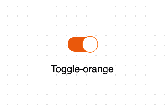
A collection of customizable toggle switch components built with React and Tailwind CSS. Features - Minimal and Orange toggle variants - Dark mode support - Smooth transitions and animations - Fully accessible with keyboard navigation - TypeScript support with proper types - Follows shadcn/ui component patterns Variants Minimal Toggle A simple toggle switch with green accent colors and dark mode support. Features a sliding circle indicator and smooth transitions. Orange Toggle A more elaborate toggle with orange accent colors and hover effects. Includes a floating animation and custom border styling.
Built with React and Tailwind. Copy the prompt and paste it into Claude Code, Cursor or Lovable: your agent adds Toggle to your project and fits it to your theme.
Code
How Toggle is used: the demo's code. The component's own source comes with a free account.
Usage.tsx
"use client"

import { MinimalToggle, OrangeToggle } from "@/components/ui/toggle"

function MinimalToggleDemo() {
  return (
    <div className="flex flex-col items-center gap-4 p-1 text-center xl:gap-8">
      <MinimalToggle tabIndex={0} />
      <span>Toggle-minimal</span>
    </div>
  )
}

function OrangeToggleDemo() {
  return (
    <div className="flex flex-col items-center gap-4 p-1 text-center xl:gap-8">
      <OrangeToggle />
      <span>Toggle-orange</span>
    </div>
  )
}

export { MinimalToggleDemo, OrangeToggleDemo }More by Edil Ozi
View all
Scroll Velocity
458
Horizontal Scroll Carousel
109
Custom Checkbox
96
Pricing Card
30
Accordion
11
Drawer
10
Infinite Scroll
9