
About
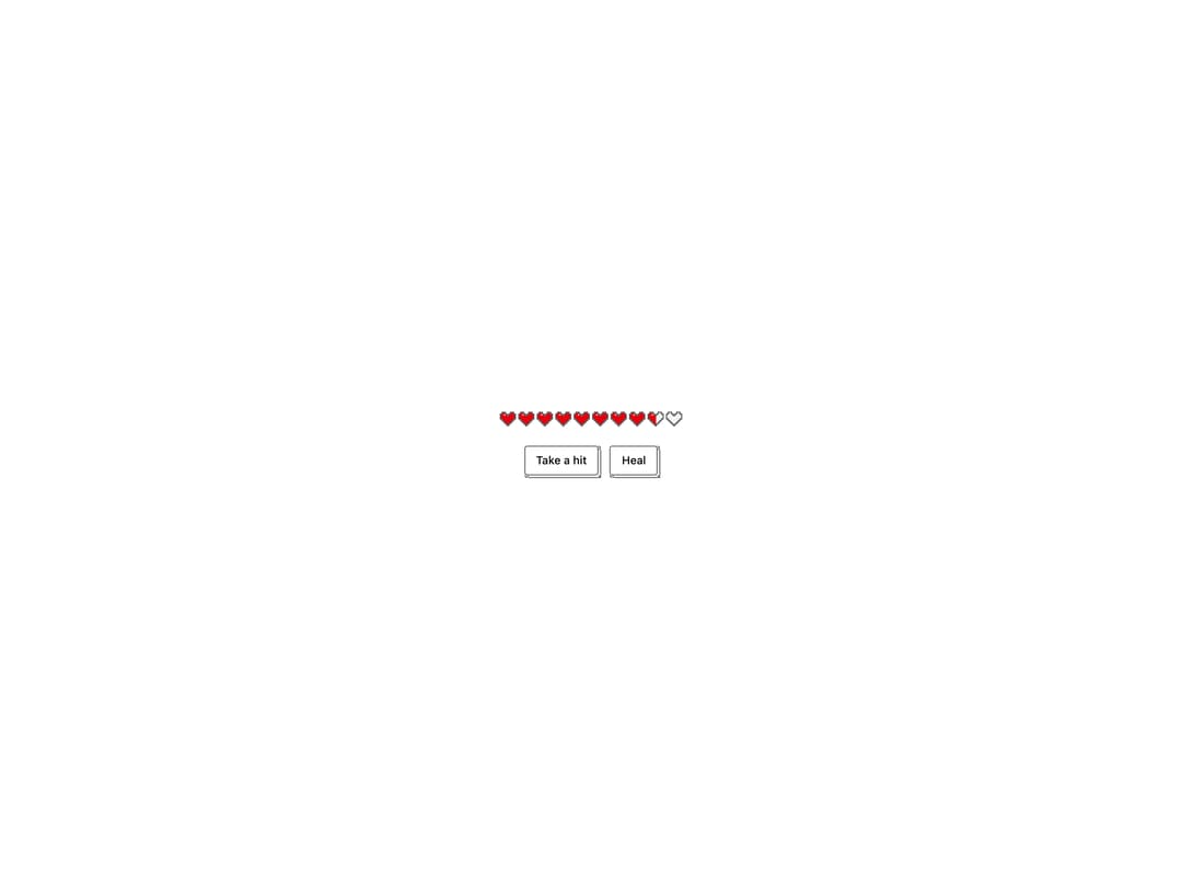
A pixel-art row of hearts that shows health or lives as a meter, with half-heart precision and a brief blink animation when a heart is lost.
Built with React and Tailwind. Copy the prompt and paste it into Claude Code, Cursor or Lovable: your agent adds Hearts Meter to your project and fits it to your theme.
Code
How Hearts Meter is used: the demo's code. The component's own source comes with a free account.
Usage.tsx
"use client";

import * as React from "react";

import { HeartsMeter } from "@/components/ui/hearts-meter";
import { IsoButton } from "@/components/ui/hearts-meter-utils/iso-button";

function HealthDemo() {
  const [hp, setHp] = React.useState(8.5);
  return (
    <div className="grid justify-items-center gap-5">
      <HeartsMeter value={hp} />
      <div className="flex gap-3">
        <IsoButton
          size="sm"
          variant="outline"
          depth={3}
          onClick={() => setHp((h) => Math.max(0, h - 1.5))}
        >
          Take a hit
        </IsoButton>
        <IsoButton
          size="sm"
          depth={3}
          onClick={() => setHp((h) => Math.min(10, h + 1))}
        >
          Heal
        </IsoButton>
      </div>
    </div>
  );
}

export default function HeartsMeterDemo() {
  return (
    <div className="flex min-h-[220px] w-full items-center justify-center bg-background p-8 text-foreground">
      <HealthDemo />
    </div>
  );
}
More by abhishek-mallick
View all
Isometric Bars Chart
13
Keys
8
Rack
7
Isometric Laptop
6
Nodes
5
Stack
5
Isometric Cube
5
Skyline
4