
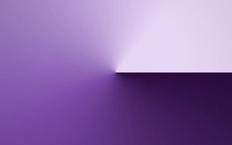
About
Pure CSS gradient background in the Orbit Sweep style, made with the 21st.dev Gradient Builder. 3-color palette (#2B0A3D, #7B4BA8, #E6D6F5). Features: film grain, vignette. A drop-in, zero-dependency React component for hero sections, cards, and page backgrounds.
Built with React and Tailwind. Copy the prompt and paste it into Claude Code, Cursor or Lovable: your agent adds Orbit Sweep to your project and fits it to your theme.
Code
How Orbit Sweep is used: the demo's code. The component's own source comes with a free account.
Usage.tsx
import { GradientBackground } from "@/components/ui/orbit-sweep"

export default function GradientBackgroundDemo() {
  return (
    <div className="relative h-[440px] w-full overflow-hidden rounded-xl">
      <GradientBackground className="h-full w-full" />
    </div>
  )
}
More by Syed
View all
Animated Beam Integration
72
Agency Bento Grid
55
Morphing Island Navbar
42
Animated Tree View
35
Morphing Language Selector
34
Interactive Eye Tracker
29
Tier Badge
20
Orbiting Circles
18