About
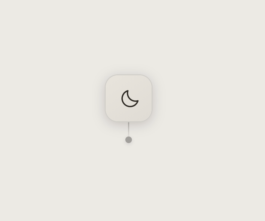
A dark/light mode toggle styled as a window-blind pull cord, where clicking swings a cord to flip venetian-blind slats revealing the sun or moon icon.
Built with React and Tailwind. Copy the prompt and paste it into Claude Code, Cursor or Lovable: your agent adds Blind Pull Toggle to your project and fits it to your theme.
Code
How Blind Pull Toggle is used: the demo's code. The component's own source comes with a free account.
Usage.tsx
import BlindPullToggle from "@/components/ui/blind-pull-toggle";

export default function BlindPullToggleDemo() {
  return (
    <div className="flex h-screen w-full items-center justify-center">
      <BlindPullToggle />
    </div>
  );
}
Dependencies
More by aicanvas
View all

Expanding Tabs
124
Stack Tower
93
Runway Loader
92
Magnetic Logo Cluster
13
Search Field
Glass Search Bar
More in Buttons
View all
Button Save
46

Button
20

Eclipse Button
5

Button
32

Button
6

Button
14

Button Group
37
Split Button
32

