
About
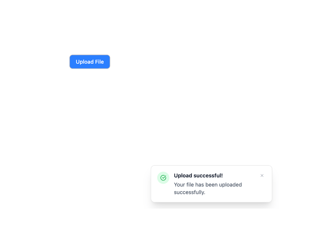
Here is Toast component
Built with React and Tailwind. Copy the prompt and paste it into Claude Code, Cursor or Lovable: your agent adds Basic Toast to your project and fits it to your theme.
Code
How Basic Toast is used: the demo's code. The component's own source comes with a free account.
Usage.tsx
"use client";

import { Toast, Toaster, createToaster } from "@ark-ui/react/toast";
import { Portal } from "@ark-ui/react/portal";
import { X, Loader2, CheckCircle, AlertCircle } from "lucide-react";

const toaster = createToaster({
  overlap: true,
  placement: "bottom-end",
  gap: 16,
});

// Simulate API call
const uploadFile = () => {
  return new Promise<void>((resolve, reject) => {
    setTimeout(() => {
      Math.random() > 0.5 ? resolve() : reject(new Error("Upload failed"));
    }, 2000);
  });
};

export default function ToastPromise() {
  const handleUpload = async () => {
    const toastId = toaster.create({
      title: "Uploading file...",
      description: "Please wait while we upload your file.",
      type: "loading",
      duration: Infinity,
    });

    try {
      await uploadFile();
      toaster.update(toastId, {
        title: "Upload successful!",
        description: "Your file has been uploaded successfully.",
        type: "success",
        duration: 5000,
      });
    } catch (error) {
      toaster.update(toastId, {
        title: "Upload failed",
        description: "Something went wrong. Please try again.",
        type: "error",
        duration: 5000,
      });
    }
  };

  return (
    <div className="bg-white dark:bg-gray-800 w-full px-4 py-12 rounded-xl flex flex-col items-center">
      <button
        type="button"
        onClick={handleUpload}
        className="px-4 py-2 bg-blue-500 text-white rounded-md hover:bg-blue-600 transition-colors text-sm font-medium"
      >
        Upload File
      </button>

      <Portal>
        <Toaster toaster={toaster}>
          {(toast) => {
            const getIcon = () => {
              switch (toast.type) {
                case "loading":
                  return (
                    <div className="w-8 h-8 bg-blue-100 rounded-full flex items-center justify-center">
                      <Loader2 className="w-4 h-4 text-blue-600 animate-spin" />
                    </div>
                  );
                case "success":
                  return (
                    <div className="w-8 h-8 bg-green-100 rounded-full flex items-center justify-center">
                      <CheckCircle className="w-4 h-4 text-green-600" />
                    </div>
                  );
                case "error":
                  return (
                    <div className="w-8 h-8 bg-red-100 rounded-full flex items-center justify-center">
                      <AlertCircle className="w-4 h-4 text-red-600" />
                    </div>
                  );
                default:
                  return null;
              }
            };

            return (
              <Toast.Root className="bg-white border rounded-lg shadow-xl min-w-80 p-4 relative overflow-anywhere transition-all duration-300 ease-default will-change-transform h-(--height) opacity-(--opacity) translate-x-(--x) translate-y-(--y) scale-(--scale) z-(--z-index)">
                <div className="flex items-start gap-3">
                  <div className="shrink-0">{getIcon()}</div>
                  <div className="flex-1">
                    <Toast.Title className="text-gray-900 font-semibold text-sm">
                      {toast.title}
                    </Toast.Title>
                    <Toast.Description className="text-gray-600 text-sm mt-1">
                      {toast.description}
                    </Toast.Description>
                  </div>
                </div>
                <Toast.CloseTrigger className="absolute top-4 right-4 p-1 hover:bg-gray-100 rounded-full transition-colors text-gray-400 hover:text-gray-600">
                  <X className="w-3 h-3" />
                </Toast.CloseTrigger>
              </Toast.Root>
            );
          }}
        </Toaster>
      </Portal>
    </div>
  );
}
Dependencies
More by Abraham
View all

Signature Pad
106
Carousel
81
timeline-animation
65
Calendar
54
QR Code
51
Menu
50
Steps
43
Angle Slider
42