
About
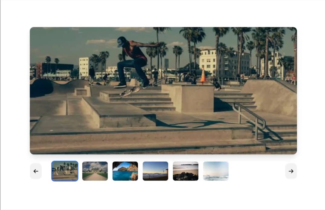
Here is Carousel component
Built with React and Tailwind. Copy the prompt and paste it into Claude Code, Cursor or Lovable: your agent adds Carousel to your project and fits it to your theme.
Code
How Carousel is used: the demo's code. The component's own source comes with a free account.
Usage.tsx
import { Carousel } from "@ark-ui/react/carousel";

export default function ThumbnailsCarousel() {
  const images = Array.from({ length: 6 }, (_, i) => ({
    full: `https://picsum.photos/seed/${i + 40}/600/400`,
    thumb: `https://picsum.photos/seed/${i + 40}/120/80`,
  }));

  return (
    <Carousel.Root
      defaultPage={0}
      slideCount={images.length}
      className="max-w-2xl mx-auto"
    >
      <Carousel.ItemGroup className="overflow-hidden rounded-lg shadow-lg mb-4">
        {images.map((image, index) => (
          <Carousel.Item key={index} index={index}>
            <img
              src={image.full}
              alt={`Slide ${index + 1}`}
              className="w-full h-80 object-cover"
            />
          </Carousel.Item>
        ))}
      </Carousel.ItemGroup>

      <div className="flex items-center gap-4">
        <Carousel.PrevTrigger className="p-2 bg-gray-100 hover:bg-gray-200 dark:bg-gray-800 dark:hover:bg-gray-700 rounded-lg transition-colors shrink-0">
          ←
        </Carousel.PrevTrigger>

        <div className="flex gap-2 overflow-x-auto scrollbar-hide flex-1 px-2">
          {images.map((image, index) => (
            <Carousel.Indicator
              key={index}
              index={index}
              className="shrink-0 border-2 border-transparent data-current:border-blue-500 rounded-md overflow-hidden cursor-pointer transition-all hover:border-gray-300"
            >
              <img
                src={image.thumb}
                alt={`Thumbnail ${index + 1}`}
                className="w-16 h-12 object-cover"
              />
            </Carousel.Indicator>
          ))}
        </div>

        <Carousel.NextTrigger className="p-2 bg-gray-100 hover:bg-gray-200 dark:bg-gray-800 dark:hover:bg-gray-700 rounded-lg transition-colors shrink-0">
          →
        </Carousel.NextTrigger>
      </div>
    </Carousel.Root>
  );
}
Dependencies
More by Abraham
View all

Signature Pad
106
timeline-animation
65
Basic Toast
56
Calendar
54
QR Code
51
Menu
50
Steps
43
Angle Slider
42
More in Galleries
View all
Thumbnail image viewer
43

Animated Gallery
1.4K

Hero Section 6
881
Editorial Collage Hero
430
Layout Grid
826
3D Parallax Unfurling Gallery
981

Image Gallery
90
File Upload
18


