
About
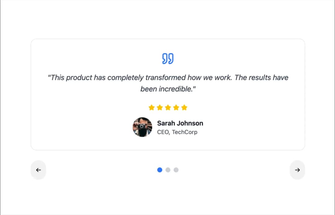
Here is Carousel component
Built with React and Tailwind. Copy the prompt and paste it into Claude Code, Cursor or Lovable: your agent adds Carousel to your project and fits it to your theme.
Code
How Carousel is used: the demo's code. The component's own source comes with a free account.
Usage.tsx
import { Carousel } from "@ark-ui/react/carousel";
import { StarIcon, QuoteIcon } from "lucide-react";

export default function TestimonialsCarousel() {
  const testimonials = [
    {
      name: "Sarah Johnson",
      role: "CEO, TechCorp",
      content:
        "This product has completely transformed how we work. The results have been incredible.",
      rating: 5,
      avatar: "https://cdn.21st.dev/assets/mirror/40/409a1e01a9c4a769eabf6eaedecb730e5fbe4e73606d91ac330f2a6e7a049ab2.jpg",
    },
    {
      name: "Michael Chen",
      role: "Designer, Creative Studio",
      content:
        "Outstanding quality and attention to detail. Highly recommend to anyone looking for excellence.",
      rating: 5,
      avatar: "https://cdn.21st.dev/assets/mirror/d1/d1eec72115c973f899d3a6ee38ba05de9ed480ce9e9b7c373630508bb349be50.jpg",
    },
    {
      name: "Emily Rodriguez",
      role: "Marketing Director",
      content:
        "The team was professional and delivered exactly what we needed. Exceeded our expectations.",
      rating: 5,
      avatar: "https://cdn.21st.dev/assets/mirror/e4/e400e3837f6b6dc2b1d36a0368e6c67bb98ae31fb64aa8c2c3515faa094c199a.jpg",
    },
  ];

  return (
    <Carousel.Root
      defaultPage={0}
      slideCount={testimonials.length}
      className="max-w-2xl mx-auto"
    >
      <Carousel.ItemGroup className="min-h-64">
        {testimonials.map((testimonial, index) => (
          <Carousel.Item
            key={index}
            index={index}
            className="bg-white dark:bg-gray-800 p-8 rounded-xl shadow-base border border-gray-200 dark:border-gray-700 text-center"
          >
            <QuoteIcon className="w-8 h-8 text-blue-500 mx-auto mb-4" />
            <p className="text-gray-700 dark:text-gray-300 text-lg mb-6 italic">
              "{testimonial.content}"
            </p>
            <div className="flex items-center justify-center gap-1 mb-4">
              {Array.from({ length: testimonial.rating }).map((_, i) => (
                <StarIcon
                  key={i}
                  className="w-4 h-4 fill-yellow-400 text-yellow-400"
                />
              ))}
            </div>
            <div className="flex items-center justify-center gap-3">
              <img
                src={testimonial.avatar}
                alt={testimonial.name}
                className="w-12 h-12 rounded-full object-cover"
              />
              <div className="text-left">
                <h4 className="font-semibold text-gray-900 dark:text-white">
                  {testimonial.name}
                </h4>
                <p className="text-sm text-gray-600 dark:text-gray-400">
                  {testimonial.role}
                </p>
              </div>
            </div>
          </Carousel.Item>
        ))}
      </Carousel.ItemGroup>

      <div className="flex items-center justify-between mt-6">
        <Carousel.PrevTrigger className="p-3 bg-gray-100 hover:bg-gray-200 dark:bg-gray-800 dark:hover:bg-gray-700 rounded-full transition-colors">
          ←
        </Carousel.PrevTrigger>

        <Carousel.IndicatorGroup className="flex gap-2">
          {testimonials.map((_, index) => (
            <Carousel.Indicator
              key={index}
              index={index}
              className="w-3 h-3 rounded-full bg-gray-300 dark:bg-gray-600 data-current:bg-blue-500 dark:data-current:bg-blue-400 transition-colors cursor-pointer"
            />
          ))}
        </Carousel.IndicatorGroup>

        <Carousel.NextTrigger className="p-3 bg-gray-100 hover:bg-gray-200 dark:bg-gray-800 dark:hover:bg-gray-700 rounded-full transition-colors">
          →
        </Carousel.NextTrigger>
      </div>
    </Carousel.Root>
  );
}
Dependencies
More by Abraham
View all

Signature Pad
106
timeline-animation
65
Basic Toast
56
Calendar
54
QR Code
51
Menu
50
Steps
43
Angle Slider
42
More in Testimonials
View all

Testimonial
117
testimonial
797

Staggered Testimonials Grid
143
Testimonial 2
32

Voice Testimonial
120
Testimonial Card
69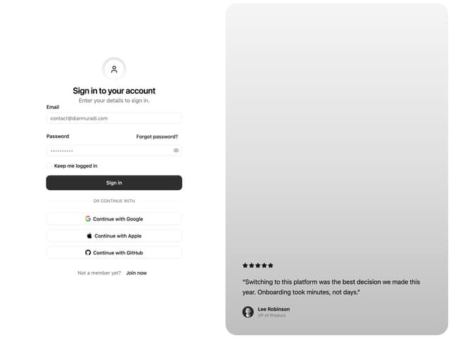

Split Sign In Form
16
Testimonials Marquee
574


