

About
Staggered grid of testimonial cards with quote icons, avatars, and decorative corner marks.
Built with React and Tailwind. Copy the prompt and paste it into Claude Code, Cursor or Lovable: your agent adds Staggered Testimonials Grid to your project and fits it to your theme.
Code
How Staggered Testimonials Grid is used: the demo's code. The component's own source comes with a free account.
Usage.tsx
import TestimonialsSection from "@/components/ui/testimonials-3";

export default function Default() {
  return (
    <section className="flex min-h-screen w-full items-center justify-center bg-background px-6 py-24 text-foreground">
      <div className="w-full">
        <div className="mx-auto mb-20 max-w-xl text-center">
          <p className="font-medium text-muted-foreground text-sm uppercase tracking-widest">
            Testimonials
          </p>
          <h2 className="mt-3 text-balance font-semibold text-3xl tracking-tight sm:text-4xl">
            Loved by builders everywhere
          </h2>
          <p className="mt-4 text-muted-foreground">
            Don't take our word for it — here's what industry leaders have to
            say.
          </p>
        </div>
        <TestimonialsSection />
      </div>
    </section>
  );
}
More by Efferd
View all

Testimonials Columns
7.1K
Zoom Parallax
5.2K
Dotted Surface
3.5K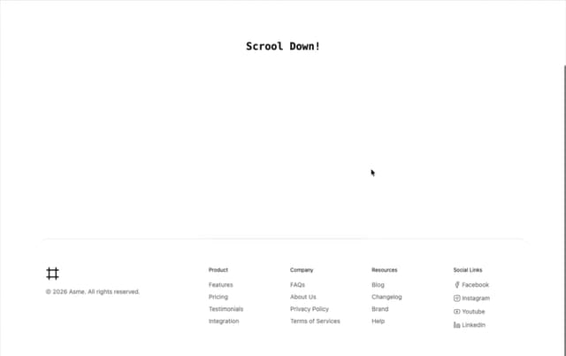
Footer Section
2.7K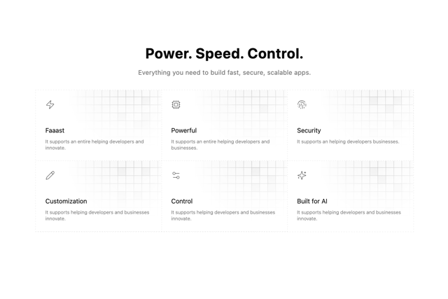
Grid Feature Cards
1.9K
Logo Cloud 2
1.6K
Header 3
1.5K
Logo Cloud 3
1.5K
More in Testimonials
View all

Testimonial
194
testimonial
790
Testimonials Section
239
Testimonial Card
69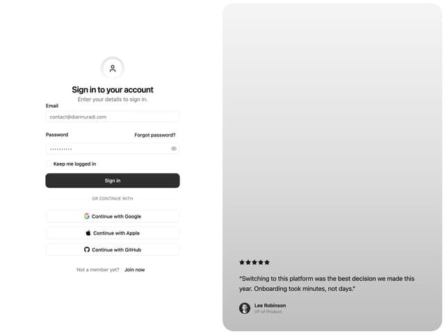

Split Sign In Form
13
Testimonial 2
31
Testimonials Section
152

Testimonials
244


