
About
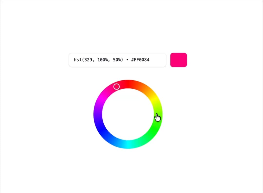
Here is Color Picker component
Built with React and Tailwind. Copy the prompt and paste it into Claude Code, Cursor or Lovable: your agent adds Color Picker to your project and fits it to your theme.
Code
How Color Picker is used: the demo's code. The component's own source comes with a free account.
Usage.tsx
// TODO: Add code"use client";

import { AngleSlider } from "@ark-ui/react/angle-slider";
import { parseColor } from "@ark-ui/react/color-picker";
import { useState } from "react";

export default function HueWheelColorPicker() {
  const [hue, setHue] = useState(329);

  // Convert hue angle to HSL color with better precision
  const getHueColor = (hueValue: number) => {
    return `hsl(${Math.round(hueValue)}, 100%, 50%)`;
  };

  // Get hex color for display
  const getHexColor = (hueValue: number) => {
    return parseColor(`hsl(${hueValue}, 100%, 50%)`).toString("hex");
  };

  return (
    <div className="w-full max-w-sm mx-auto">
      <div className="space-y-6">
        {/* Color display */}
        <div className="flex items-center gap-3">
          <input
            type="text"
            value={`${getHueColor(hue)} • ${getHexColor(hue)}`}
            readOnly
            className="flex-1 px-4 py-3 text-sm font-mono border border-gray-200 dark:border-gray-700 rounded-lg bg-white dark:bg-gray-900 text-gray-900 dark:text-gray-100 focus:outline-hidden focus:ring-2 focus:ring-blue-500 focus:border-blue-500 transition-all duration-200 shadow-xs"
          />
          <div
            className="w-14 h-12 rounded-lg border border-gray-200 dark:border-gray-700 shadow-xs"
            style={{ backgroundColor: getHueColor(hue) }}
          />
        </div>

        {/* Hue Wheel */}
        <div className="flex justify-center py-4">
          <AngleSlider.Root
            value={hue}
            onValueChange={(details) => setHue(details.value)}
            className="relative flex items-center justify-center"
          >
            <AngleSlider.Control
              className="w-56 h-56 rounded-full relative cursor-pointer [mask:radial-gradient(circle,transparent_52%,transparent_53%,black_53%,black_62%)]"
              style={{
                background: `conic-gradient(
                  hsl(0, 100%, 50%) 0deg,
                  hsl(30, 100%, 50%) 30deg,
                  hsl(60, 100%, 50%) 60deg,
                  hsl(90, 100%, 50%) 90deg,
                  hsl(120, 100%, 50%) 120deg,
                  hsl(150, 100%, 50%) 150deg,
                  hsl(180, 100%, 50%) 180deg,
                  hsl(210, 100%, 50%) 210deg,
                  hsl(240, 100%, 50%) 240deg,
                  hsl(270, 100%, 50%) 270deg,
                  hsl(300, 100%, 50%) 300deg,
                  hsl(330, 100%, 50%) 330deg,
                  hsl(360, 100%, 50%) 360deg
                )`,
              }}
            >
              <AngleSlider.Thumb className="absolute top-0 right-0 bottom-0 left-[calc(50%-1.5px)] pointer-events-none h-full w-[3px] flex items-start outline-hidden">
                <span className="border-2 border-white size-5 rounded-full shrink-0 shadow-gray-600 shadow-xs m-1.5" />
              </AngleSlider.Thumb>
            </AngleSlider.Control>

            <AngleSlider.HiddenInput />
          </AngleSlider.Root>
        </div>
      </div>
    </div>
  );
}
Dependencies
More by Abraham
View all

Signature Pad
106
Carousel
80
timeline-animation
65
Basic Toast
56
Calendar
54
QR Code
51
Menu
50
Steps
43