
About
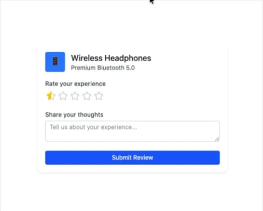
Here is Rating Group component
Built with React and Tailwind. Copy the prompt and paste it into Claude Code, Cursor or Lovable: your agent adds Rating Group to your project and fits it to your theme.
Code
How Rating Group is used: the demo's code. The component's own source comes with a free account.
Usage.tsx
"use client";

import { RatingGroup } from "@ark-ui/react/rating-group";
import { StarIcon, StarHalfIcon } from "lucide-react";
import { useState } from "react";

export default function ProductReview() {
  const [rating, setRating] = useState(0);
  const [review, setReview] = useState("");

  const ratingLabels = ["Poor", "Fair", "Good", "Very Good", "Excellent"];

  return (
    <div className="max-w-sm w-full bg-white dark:bg-gray-800 rounded-lg shadow p-4">
      <div className="flex items-center space-x-3 mb-4">
        <div className="w-10 h-10 bg-blue-500 rounded flex items-center justify-center">
          <span className="text-white text-sm">📱</span>
        </div>
        <div>
          <h3 className="font-medium text-gray-900 dark:text-white">
            Wireless Headphones
          </h3>
          <p className="text-xs text-gray-600 dark:text-gray-400">
            Premium Bluetooth 5.0
          </p>
        </div>
      </div>

      <div className="space-y-3">
        <div>
          <label className="block text-xs font-medium text-gray-700 dark:text-gray-300 mb-1">
            Rate your experience
          </label>
          <RatingGroup.Root
            count={5}
            value={rating}
            onValueChange={(details) => setRating(details.value)}
            allowHalf
          >
            <RatingGroup.Control className="inline-flex">
              <RatingGroup.Context>
                {({ items }) =>
                  items.map((item) => (
                    <RatingGroup.Item
                      key={item}
                      index={item}
                      className="w-6 h-6 p-0.5 focus:outline-none focus:ring-1 focus:ring-blue-500 rounded"
                    >
                      <RatingGroup.ItemContext>
                        {({ half, highlighted }) => {
                          if (half) {
                            return (
                              <div className="relative w-5 h-5">
                                <StarIcon className="w-5 h-5 text-gray-300 dark:text-gray-600" />
                                <div className="absolute inset-0 overflow-hidden w-1/2">
                                  <StarIcon className="w-5 h-5 text-yellow-400 fill-current" />
                                </div>
                              </div>
                            );
                          }
                          if (highlighted) {
                            return (
                              <StarIcon className="w-5 h-5 text-yellow-400 fill-current" />
                            );
                          }
                          return (
                            <StarIcon className="w-5 h-5 text-gray-300 dark:text-gray-600" />
                          );
                        }}
                      </RatingGroup.ItemContext>
                    </RatingGroup.Item>
                  ))
                }
              </RatingGroup.Context>
              <RatingGroup.HiddenInput />
            </RatingGroup.Control>
          </RatingGroup.Root>
          {rating > 0 && (
            <p className="text-xs text-gray-600 dark:text-gray-400 mt-1">
              {ratingLabels[Math.floor(rating) - 1]}
            </p>
          )}
        </div>

        <div>
          <label className="block text-xs font-medium text-gray-700 dark:text-gray-300 mb-1">
            Share your thoughts
          </label>
          <textarea
            value={review}
            onChange={(e) => setReview(e.target.value)}
            placeholder="Tell us about your experience..."
            className="w-full px-2 py-1 text-xs border border-gray-300 dark:border-gray-600 rounded focus:outline-none focus:ring-1 focus:ring-blue-500 dark:bg-gray-800 dark:text-white"
            rows={2}
          />
        </div>

        <button className="w-full px-3 py-1.5 bg-blue-600 text-white text-xs rounded hover:bg-blue-700 focus:outline-none focus:ring-1 focus:ring-blue-500">
          Submit Review
        </button>
      </div>
    </div>
  );
}
Dependencies
More by Abraham
View all

Signature Pad
107
Carousel
81
timeline-animation
65
Basic Toast
56
Calendar
54
QR Code
51
Menu
50
Steps
43
More in Forms
View all

Premium Auth
500

Login 1
52
Authentication Card
47

Book A Demo 3
83
Book A Demo 1
69

Contact Card
1K

Login Card
32

Login 2
7
