
About
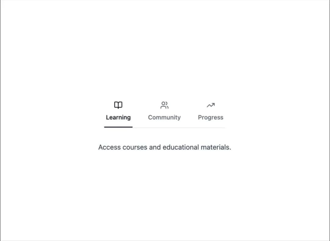
Here is Tabs component
Built with React and Tailwind. Copy the prompt and paste it into Claude Code, Cursor or Lovable: your agent adds Tabs Component to your project and fits it to your theme.
Code
How Tabs Component is used: the demo's code. The component's own source comes with a free account.
Usage.tsx
"use client";

import { Tabs } from "@ark-ui/react/tabs";
import { BookOpen, Users, TrendingUp } from "lucide-react";

const tabs = [
  {
    value: "overview",
    label: "Learning",
    icon: BookOpen,
    content: "Access courses and educational materials.",
  },
  {
    value: "projects",
    label: "Community",
    icon: Users,
    content: "Connect with peers and join discussions.",
  },
  {
    value: "packages",
    label: "Progress",
    icon: TrendingUp,
    content: "Track your learning achievements and goals.",
  },
];

export default function TabsIconAbove() {
  return (
    <div className="bg-white dark:bg-gray-800 w-full px-4 py-12 rounded-xl flex flex-col items-center">
      <Tabs.Root
        defaultValue="overview"
        className="w-full flex flex-col items-center"
      >
        <Tabs.List className="flex gap-8 relative border-b border-gray-200 dark:border-gray-700 mb-8 w-fit">
          {tabs.map((tab) => {
            const Icon = tab.icon;
            return (
              <Tabs.Trigger
                key={tab.value}
                value={tab.value}
                className="flex flex-col items-center gap-2 px-1 py-3 text-sm font-medium text-gray-500 hover:text-gray-700 transition-colors data-selected:text-gray-900 relative border-b-2 border-transparent data-selected:border-gray-900 dark:text-gray-400 dark:hover:text-gray-200 dark:data-selected:text-gray-100 dark:data-selected:border-gray-100"
              >
                <Icon className="w-5 h-5" />
                {tab.label}
              </Tabs.Trigger>
            );
          })}
        </Tabs.List>

        {tabs.map((tab) => (
          <Tabs.Content
            key={tab.value}
            value={tab.value}
            className="text-center text-gray-600 dark:text-gray-300"
          >
            {tab.content}
          </Tabs.Content>
        ))}
      </Tabs.Root>
    </div>
  );
}
Dependencies
More by Abraham
View all

Signature Pad
107
Carousel
81
timeline-animation
65
Basic Toast
56
Calendar
54
QR Code
51
Menu
50
Steps
43
More in Navigation
View all

Sidebar
234
Navbar with Theme Toggle
43

Sidebar
339

Tabs
60
Numberless Pagination with Text
11
Oversized 404 Numeral
50
Footer
446
Pagination
43


