
About
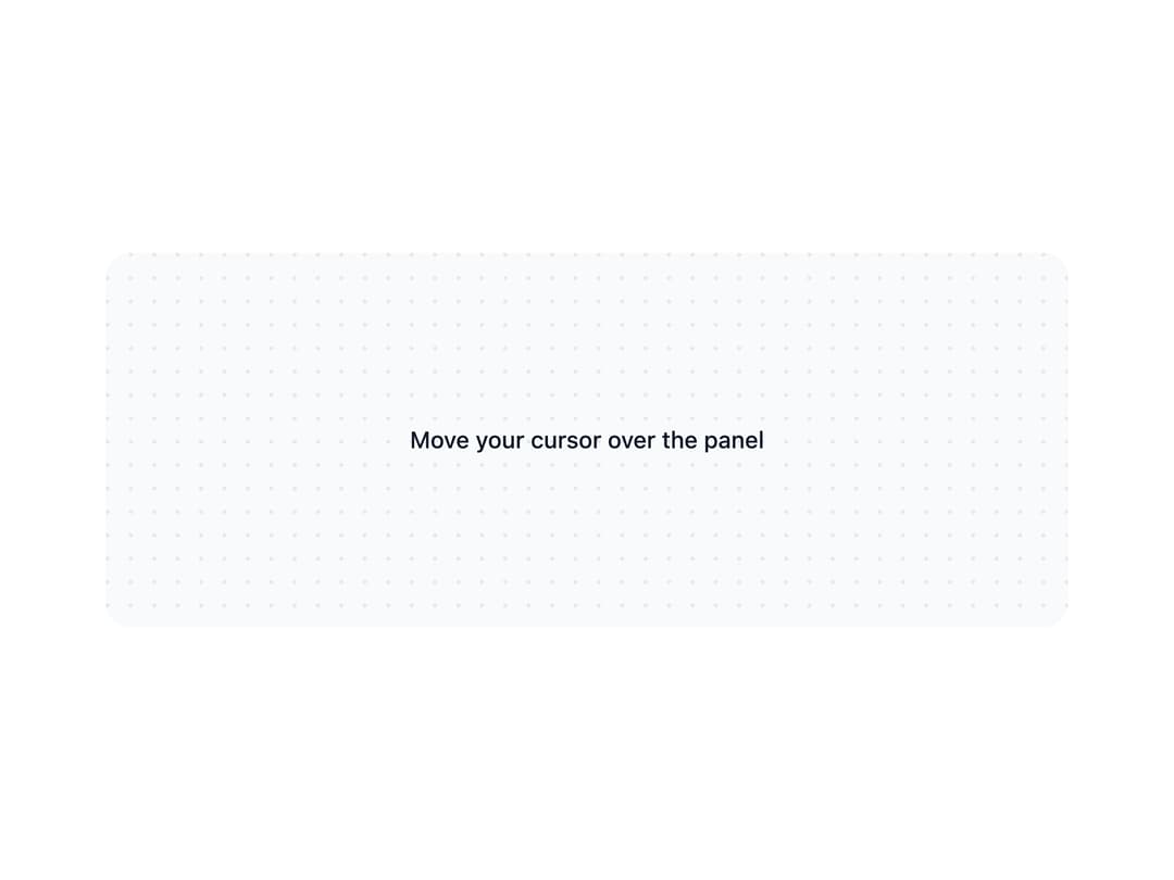
A decorative dots/grid/hexagon/rings/checkerboard pattern painted behind page content, with an optional cursor-following spotlight highlight.
Built with React and Tailwind. Copy the prompt and paste it into Claude Code, Cursor or Lovable: your agent adds Background Pattern to your project and fits it to your theme.
Code
How Background Pattern is used: the demo's code. The component's own source comes with a free account.
Usage.tsx
import { BackgroundPattern } from "@/components/ui/background-pattern";

export default function BackgroundPatternSpotlight() {
  return (
    <BackgroundPattern
      variant="dots"
      spotlight
      className="bg-background-subtle flex min-h-56 w-full max-w-xl items-center justify-center overflow-hidden rounded-xl"
    >
      <span className="text-foreground-intense text-sm font-medium">
        Move your cursor over the panel
      </span>
    </BackgroundPattern>
  );
}
More by appica-dev
View all
Border Beam
43
Text Animate
19
Carousel
14
Sparkline
7
Table of Contents
6
Color Area
6
Avatar
6
Autocomplete
2