
About
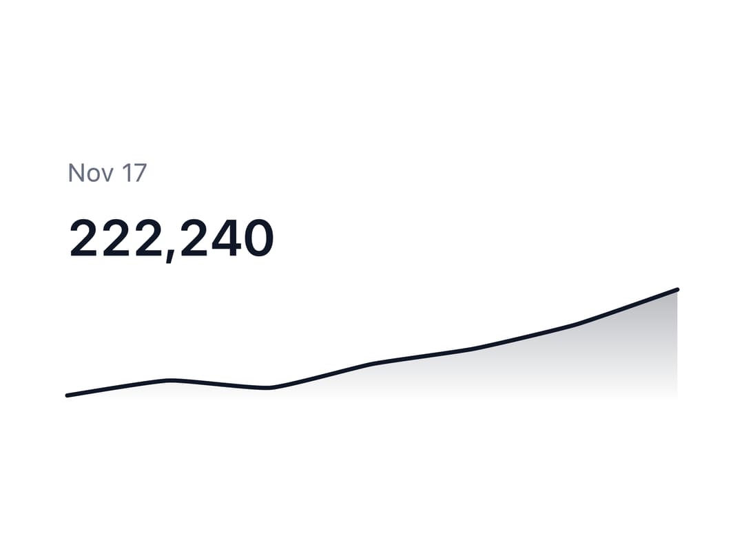
A compact inline chart (line, area, or column) that shows a data trend at a glance inside a KPI card, table row, or dashboard header, with an optional hover tooltip and live-updating value/label.
Built with React and Tailwind. Copy the prompt and paste it into Claude Code, Cursor or Lovable: your agent adds Sparkline to your project and fits it to your theme.
Code
How Sparkline is used: the demo's code. The component's own source comes with a free account.
Usage.tsx
import {
  Sparkline,
  SparklineChart,
  SparklineValue,
  SparklineLabel,
} from "@/components/ui/sparkline";

export default function SparklineStat() {
  return (
    <Sparkline
      data={[198_120, 201_540, 199_880, 205_300, 208_770, 214_260, 222_240]}
      labels={[
        "Nov 11",
        "Nov 12",
        "Nov 13",
        "Nov 14",
        "Nov 15",
        "Nov 16",
        "Nov 17",
      ]}
      className="w-72 max-w-full"
    >
      <SparklineLabel />
      <SparklineValue className="text-2xl" />
      <SparklineChart
        fill
        height={56}
        tooltip
        aria-label="Active users this week"
      />
    </Sparkline>
  );
}
More by appica-dev
View all
Border Beam
43
Text Animate
19
Carousel
14
Table of Contents
6
Color Area
6
Avatar
6
Background Pattern
3
Autocomplete
2