
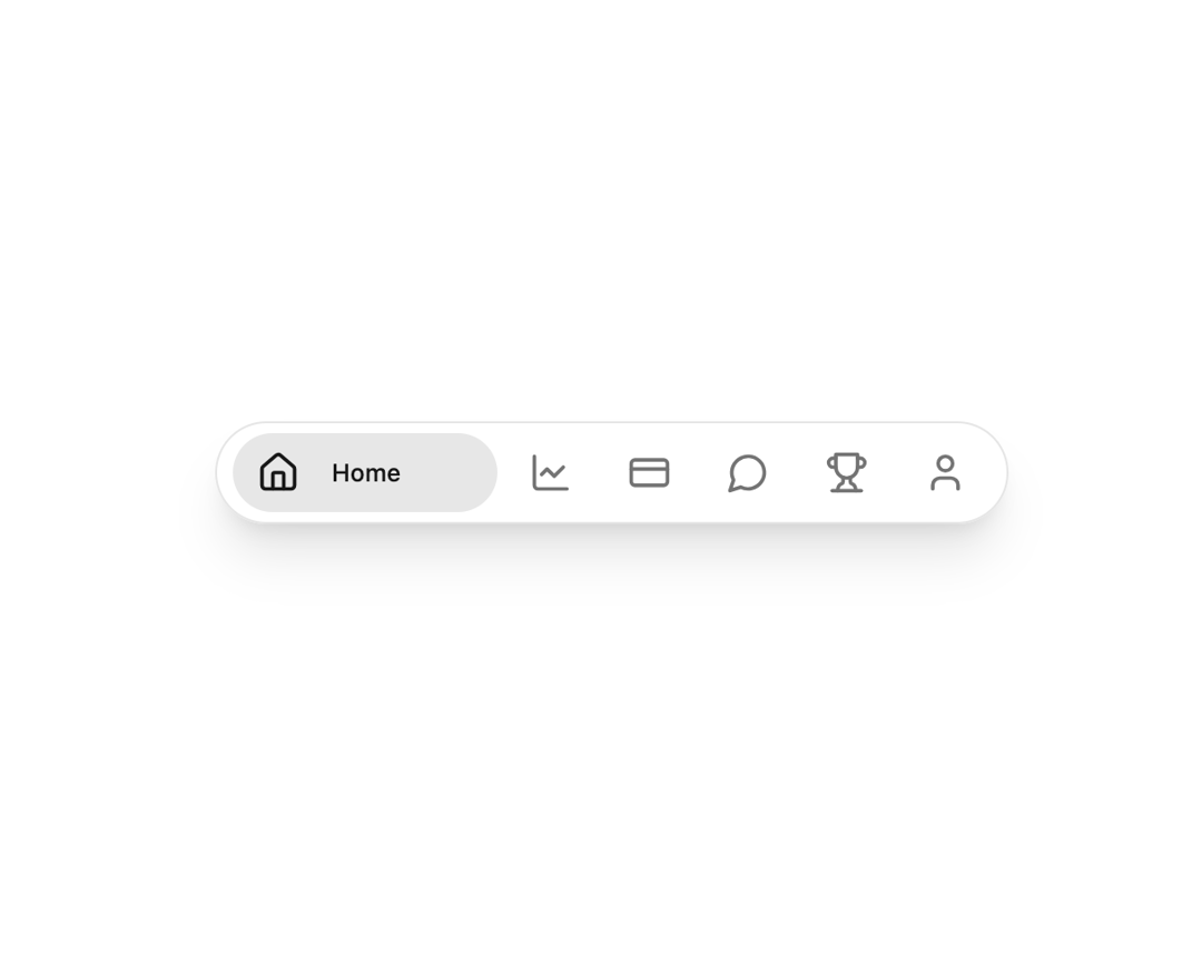
A highly animated, touch-friendly mobile/navigation bar component for dashboard or finance applications. Built with Next.js, TypeScript, TailwindCSS v4, and Framer Motion, it delivers a visually appealing pill-style layout with seamless in-out label animation for active tabs. Each tab displays its icon and label only when active, with transition effects fully powered by responsive Tailwind utilities and Framer Motion—no inline styles. The component supports shadcn/ui theming, integrates accessibility best practices, and offers a sticky bottom mode via a single prop (stickyBottom). Designed and coded to meet 21st.dev's UI/UX and code standards, it’s ready for production integration, with dark theme support and easy configuration for icon and label sets.
Built with React and Tailwind. Copy the prompt and paste it into Claude Code, Cursor or Lovable: your agent adds Bottom Nav Bar to your project and fits it to your theme.
Code
How Bottom Nav Bar is used: the demo's code. The component's own source comes with a free account.
Usage.tsx
import BottomNavBar from '@/components/ui/bottom-nav-bar'

export default function Demo() {
  return <BottomNavBar />
}
Dependencies
More by Arunachalam
View all
Scroll media expansion hero
10.7K
Profile Card Testimonial Carousel
1.2K
Modern Animated Sign In
1.1K
Adaptive Notch Navigation Bar
661
Toast
659
Connected Carousel
383
Animated File Tree
337
Inverted Cursor
296
More in Navigation
View all

Sidebar
234

Tabs
60
Newsletter Signup Footer
16
Progress Bar Stepper
36

Footer 2
201
Navbar with Theme Toggle
43

Navbar
71

Pagination
86
