About
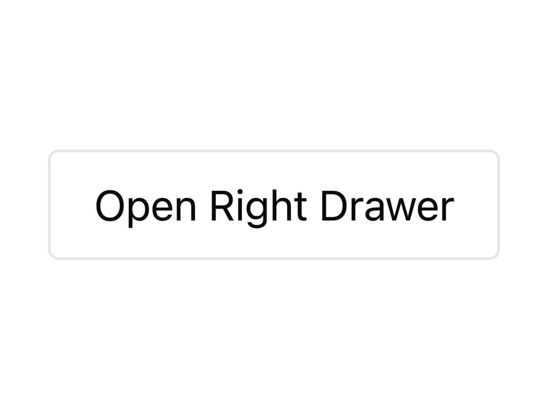
A panel that slides in from an edge of the screen (bottom, top, left, or right) with swipe-to-dismiss gesture support, used for mobile sheets, side panels, and quick actions.
Built with React and Tailwind. Copy the prompt and paste it into Claude Code, Cursor or Lovable: your agent adds Drawer to your project and fits it to your theme.
Code
How Drawer is used: the demo's code. The component's own source comes with a free account.
Usage.tsx
"use client";

import { Drawer } from "@/components/ui/drawer";

export default function DrawerRightDemo() {
  return (
    <div className="flex min-h-[420px] w-full items-center justify-center">
      <Drawer.Root side="right">
        <Drawer.Trigger className="px-4 py-2 border rounded">
          Open Right Drawer
        </Drawer.Trigger>
        <Drawer.Portal>
          <Drawer.Backdrop />
          <Drawer.Viewport>
            <Drawer.Popup>
              <Drawer.Content>
                <Drawer.Title>Right Drawer</Drawer.Title>
                <Drawer.Description>
                  Ideal for side panels, detail inspectors, and settings.
                </Drawer.Description>
                <Drawer.Close className="mt-4 px-3 py-1 bg-secondary rounded">
                  Close
                </Drawer.Close>
              </Drawer.Content>
            </Drawer.Popup>
          </Drawer.Viewport>
        </Drawer.Portal>
      </Drawer.Root>
    </div>
  );
}
More by awaiden
View all

Form
Toast
Combobox