
About
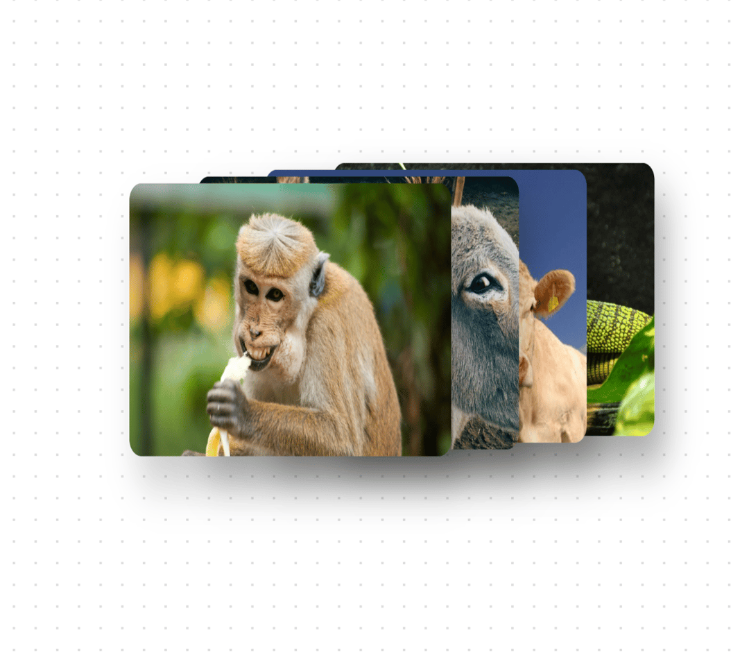
An interactive card stack component with 3D hover effects and animations. Perfect for showcasing images, portfolios, or featured content. Features - Smooth 3D rotation effects - Responsive design - Interactive card selection - Customizable card dimensions - Configurable stack spacing - Mobile-friendly fallback animations - Blur effects for depth perception
Built with React and Tailwind. Copy the prompt and paste it into Claude Code, Cursor or Lovable: your agent adds 3D Flip Card to your project and fits it to your theme.
Code
How 3D Flip Card is used: the demo's code. The component's own source comes with a free account.
Usage.tsx
'use client'

import { CardStack3D } from "@/components/ui/3d-flip-card"

export function CardStackDemo() {
  const images = [
    {
      src: "https://cdn.21st.dev/assets/mirror/64/6425a7d62b05ac5d76c6d1179965a954ca820a1b548a111555800022eae582a1.jpg",
      alt: "Monkey"
    },
    {
      src: "https://cdn.21st.dev/assets/mirror/f6/f602867d9d5796339a34d88e037860ffeb5c335dbb2b97495ed653858f3a6be5.jpg",
      alt: "Donkey"
    },
    {
      src: "https://cdn.21st.dev/assets/mirror/25/2529e2d1d0276520e267c1d53887ac768389b00cd4aa7a9cc74889e064099229.jpg",
      alt: "Cow"
    },
    {
      src: "https://cdn.21st.dev/assets/mirror/38/38f27cee78085da514f7e26c5089117b13b1b4ca1113716108278f608ff7a1f8.jpg",
      alt: "Chameleon"
    },
  ]

  return (
    <div className="min-h-screen flex items-center justify-center">
      <CardStack3D
        images={images}
        cardWidth={320}
        cardHeight={192}
        spacing={{ x: 50, y: 50 }}
      />
    </div>
  )
}
Dependencies
More by Ayushmaan Singh
View all

Tubelight Navbar
3.6K
Theme Toggle
2.5K
Feature Section
1.7K
Vintage Keyboard
570
Thumbnail Carousel
409
Typewriter Testimonial
318
Image Fan Carousel
283
Testimonials
245
More in Cards
View all
Stats cards with links
33

Course Design Cards
1.1K

Card
70
Statistics Card 2
264
Statistics Card 10
263

Card
17

Card Studio
9
The Item one
3
