
About
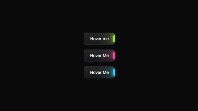
A visually distinct button component featuring a configurable, animated glow effect to highlight calls to action or important interactions.
Built with React and Tailwind. Copy the prompt and paste it into Claude Code, Cursor or Lovable: your agent adds Glowing Button to your project and fits it to your theme.
Code
How Glowing Button is used: the demo's code. The component's own source comes with a free account.
Usage.tsx
import { Component } from "@/components/ui/glowing-button";

const DemoOne = () => {
  return (
    <div className="flex flex-col gap-4 w-full h-screen justify-center items-center">
      <Component>Hover me</Component>
      <Component glowColor="#ec4899">Hover me</Component>
      <Component glowColor="#22d3ee">Hover me</Component>
    </div>
  );
};

export { DemoOne };
More by badtz
View all
Animated Card Chart
1K
Animated Card Diagram
627
Animated Card
465
dock
337
Border Beam
181
Cursor Cards
180
Star Button
86
Cloud Orbit
72
More in Buttons
View all
Button Save
46

Button
20

Eclipse Button
5

Button
6

Button
14

Button Group
37

Button
32
Split Button
32

